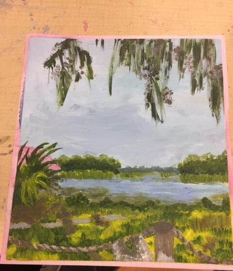
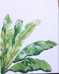
 CRITIQUE: This watercolor painting is of tropical leaves. The leaves are in different angles such as curved, diagonal, and horizontal. The color of the art is bright green, dull yellow, and a bit of silver. There is a balance of blank space and the painting itself. The value of the painting is light and airy. The texture of this piece is smooth and silky looking. The leaves are mostly the same size and are very close together and slightly spaced out at points. The mood of this piece is happy and colorful. there is no story being told but this piece does represent nature. I honestly love this piece! I think it was very successful. The leaves look so real and I love the silver streaks. I do think that I could have made the yellow stems a little smaller, but overall I love this piece.
0 Comments
Art Criticism Process
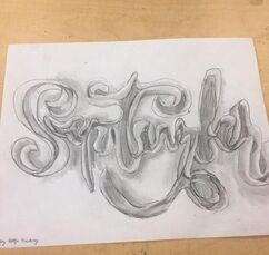
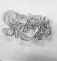
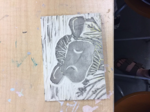
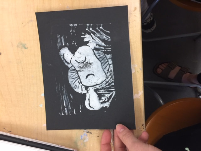
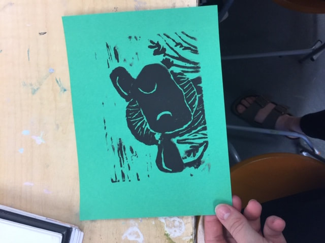
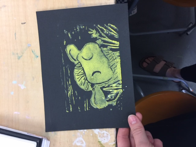
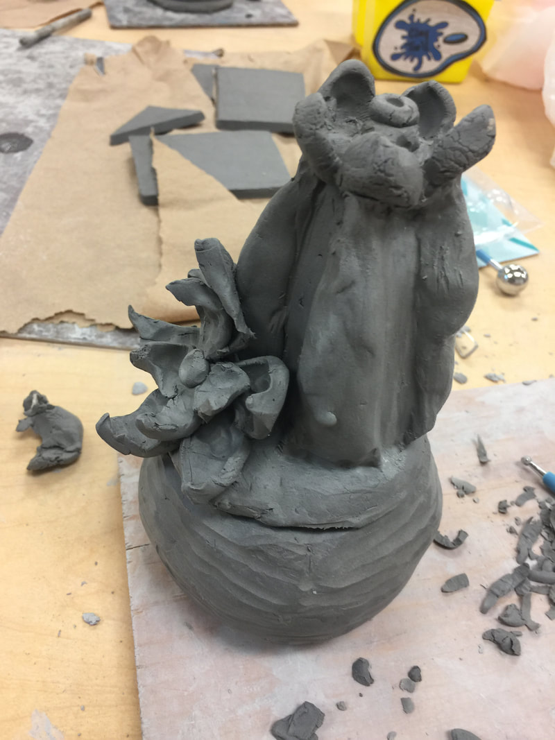
Process: The first step that I took to create this is I first glued on a 3D part of the word I chose. (on the right) This is the base for the project. Then I took a picture of this and then turned the picture black and white so that it would be easier to see the contrast. After I did that I drew an outline of the word and then later added the shadows and creases.
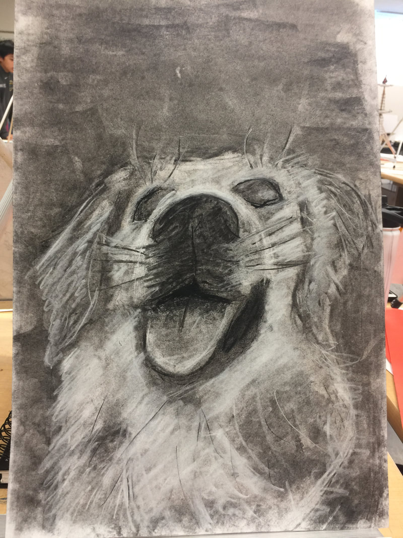
Pros: The pros of this are that it actually looks real and I am super proud of it. It looks this way because of the shading. The shading is probably the best part of this piece. Cons: The con of this project was that if you did not get the shading just right it would not look real and that was a little frustrating. I had to fix my shading multiple times. 
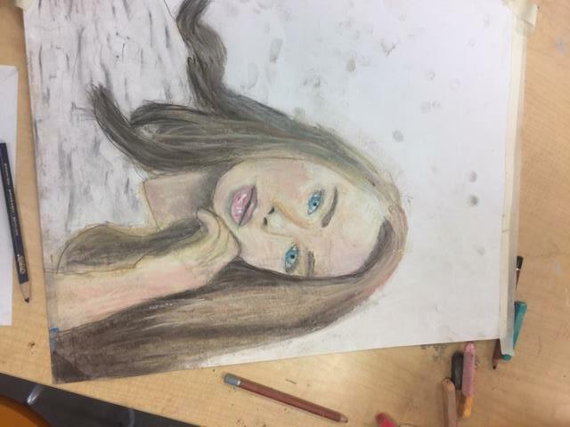
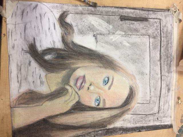
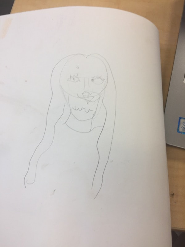
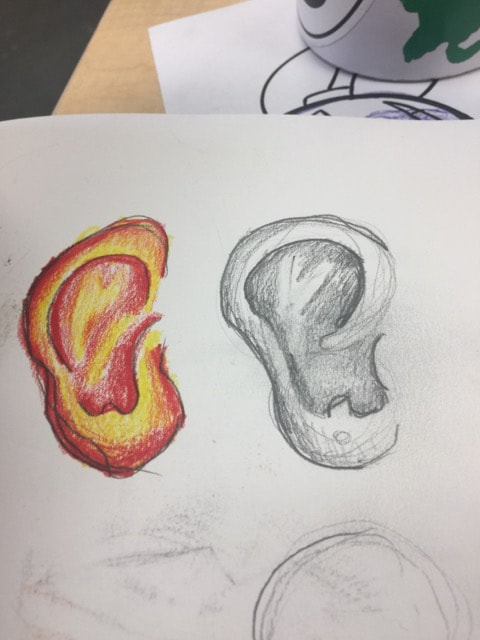
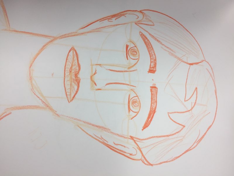
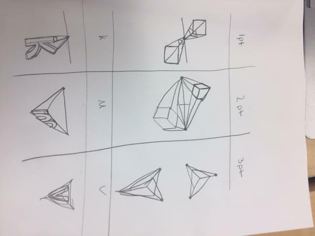
   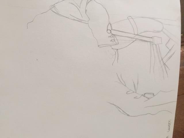 The most helpful warm up this unit was the upside down Picasso drawing because it helped me find shapes in the drawing rather than the object its self.
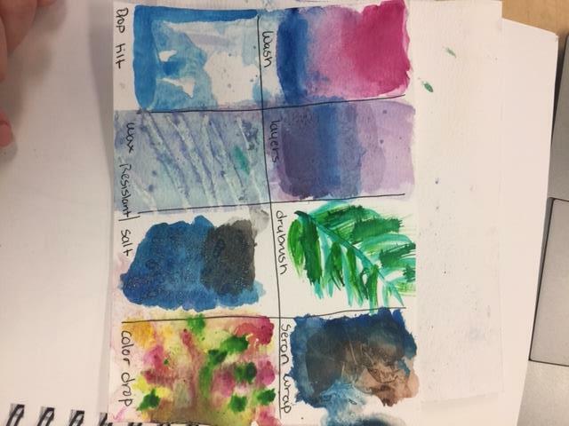
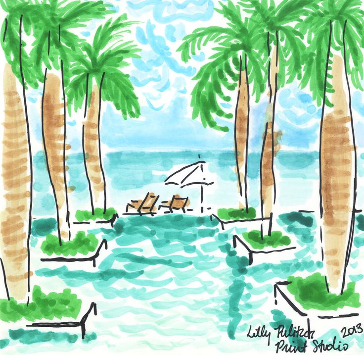
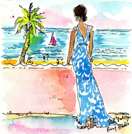
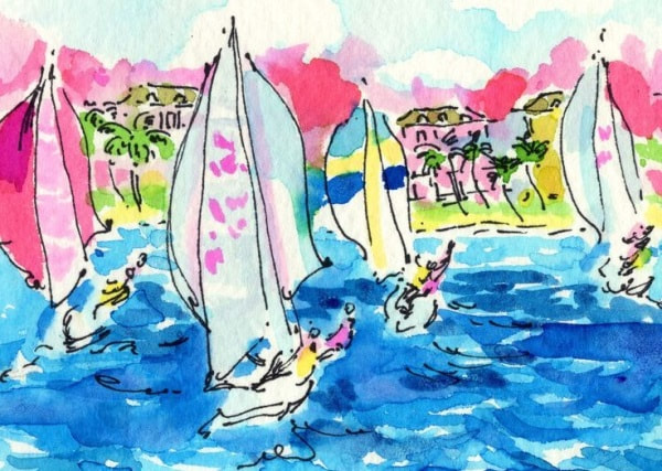
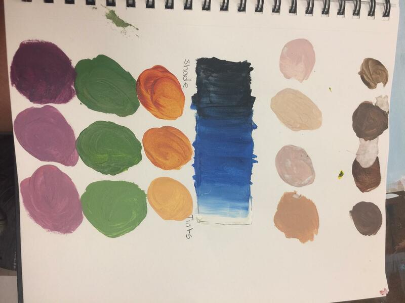
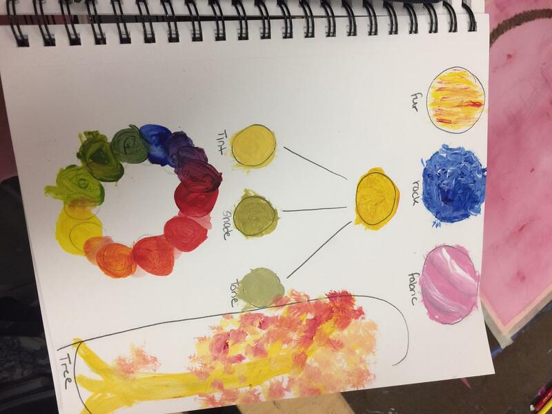
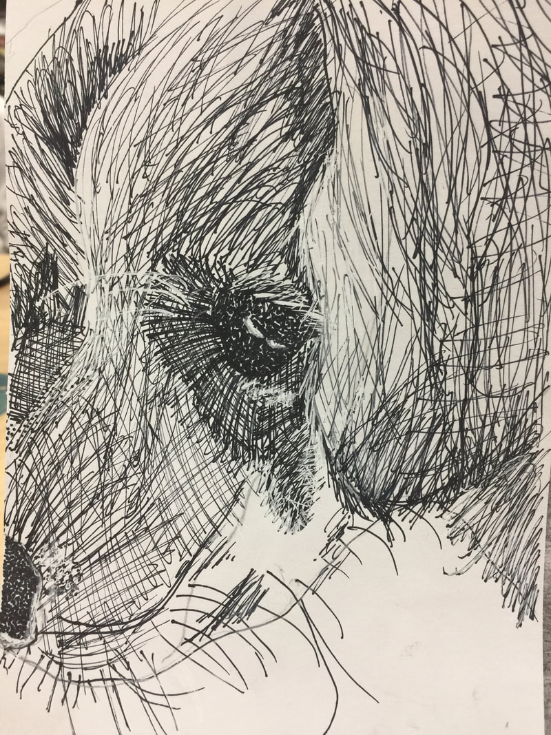
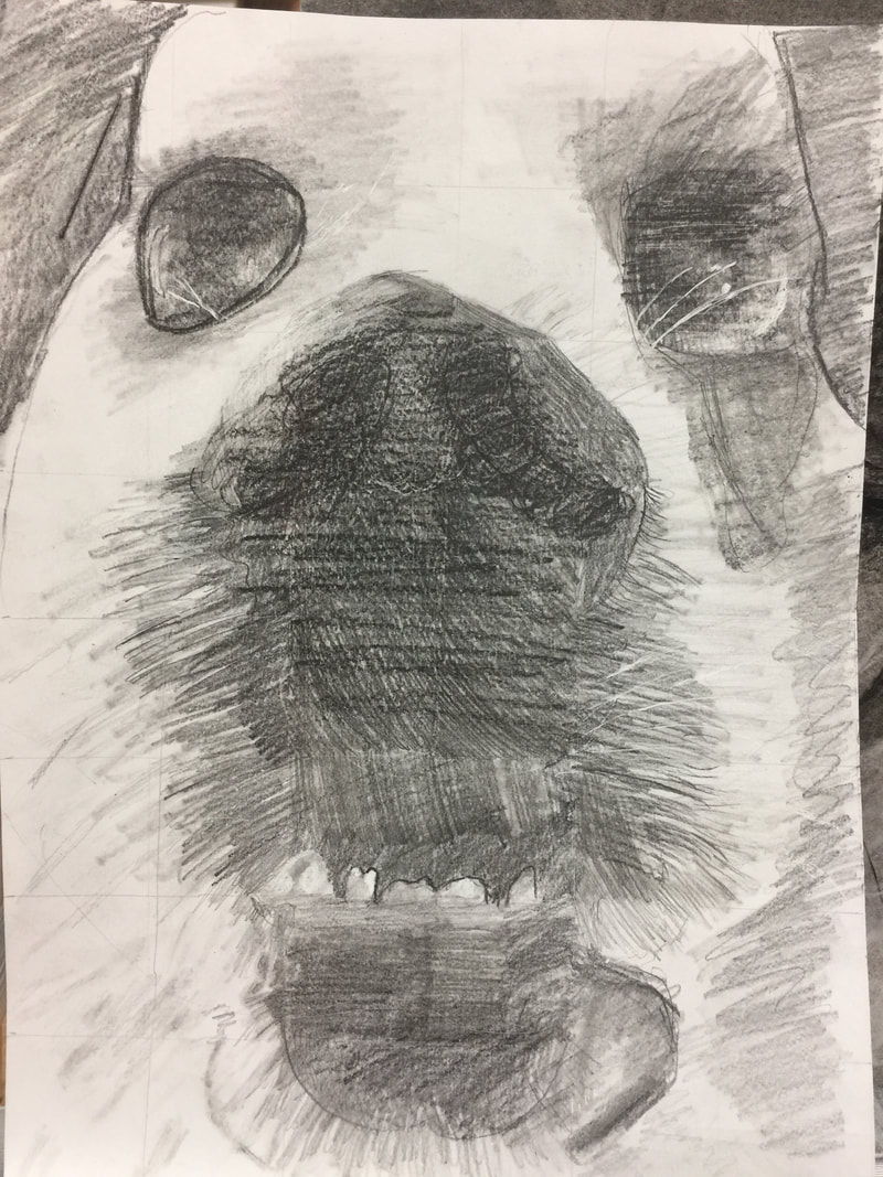
composition: The placement and/or arrangement of elements of the art peace. Value: The lightness or darkness of colors or shading Pen The pros of pen art is that you can pretty much be sloppy and still make it look good depending on the technique you used. The cons of the pen art was doing highlights and bright spots because the pen was so dark and it was hard to make lighter spots. Pencil The pros of the pencil art is that you can erase the drawing to make light spots and start over. The cons of the pencil art is that the darker spots of black are hard to get and the pencil is just really hard in my opinion. Charcoal The pros of the charcoal is that you can smudge out your mistakes. The cons of the charcoal is that it is very very messy and gets all over everything. The artist that inspires me is Lilly Pulitzer. You may know her as the fashion designer but she also does water color paintings to. Her bright colors make the painting pop off of the page and her fun beach themes draw you in. I love how simple but yet unique her art is. About Lilly
Name: Lilly Pulitzer Rousseau Location: Palm beach, FL Material she works with: watercolors History: She was born on November 10, 1931. She grew up in Roslyn, NY and later moved to Palm Beach, FL. She was inspired to start art by a lemonade stain on her shirt when selling lemonade. |