Art 3 Blog
All
Acrylics
Drawing
First Week
Oils
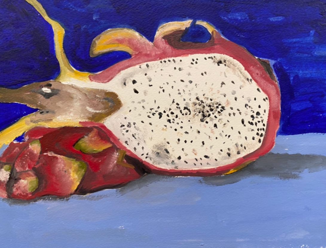
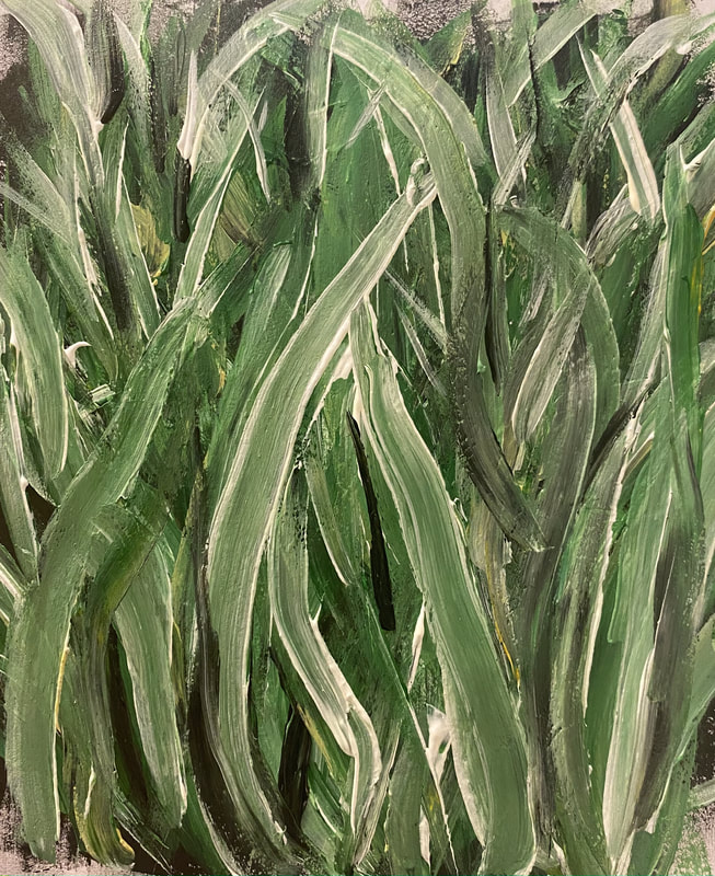
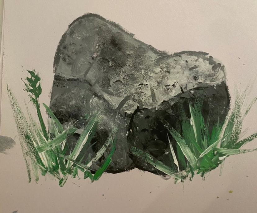
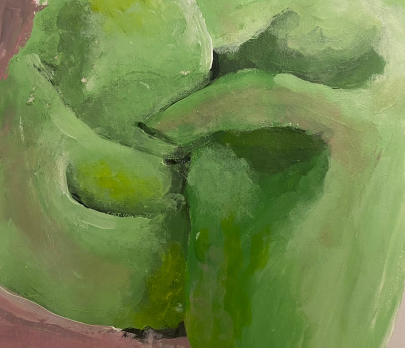
Still Life
Wearable Art
 What unit did you learn the most from during the class?
I learned the most from the Acrylics Unit. When coming into this unit I thought it would be pretty easy and that I knew a lot about acrylics already, this was not true! I did not realize how hard it would be to paint in acrylics. It is really easy to loose control with the brush. My piece that I created is not perfect at all and it is not my favorite piece but, I did learn a lot about acrylics through creating this piece. I learned how to control my brush and when to wait before adding another layer of paint. I also learned how to do washes with acrylics to give it a more rustic feel. I feel like I learned so much about this medium and I definitely will try it again and hopefully it will turn out better now that I know what I am doing.
0 Comments
Plans
   Final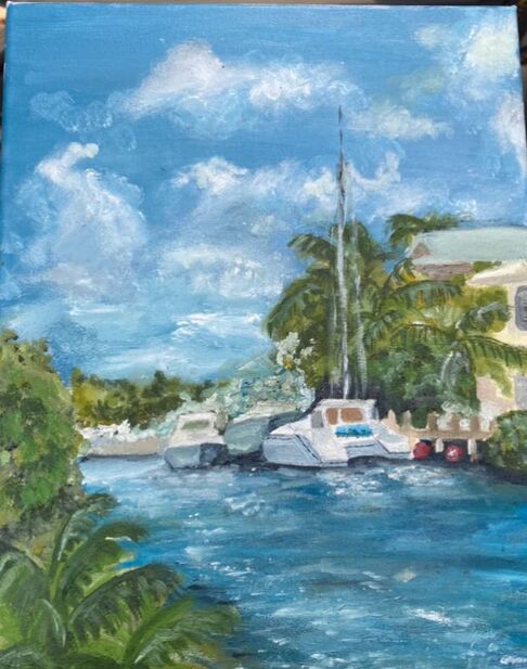 Questions
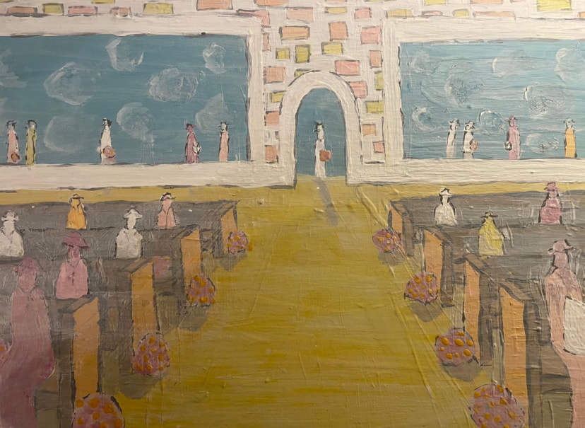
Inspiration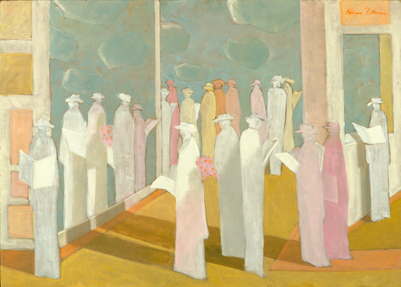 Title: The Rehearsal Artist: Hobson Pittman Date Created: 1966-1967 Size: 30 x 42in Medium: Oils on board What do you see in this piece?: In this piece I see many different colors and abstract shapes that form an image of a group of women waiting in line outside of a building. Some of the women seem to be inside of the building already. Many of them are holding papers and flowers. Why did you chose this piece?: I chose this piece because I loved all of the bright happy colors and I also loved how it was so simple but yet so complicated and interesting. Overall this piece just makes me happy and I love it! Art BreakdownColor: The colors are split complementary and pastel based colors. The colors included are pink, blue, and orange pastels. They all work together to make eachother pop out. Texture: This piece uses visual texture. It uses a soft and faded texture. It has some defined lines but they fade out at times. Subject: The subject of this piece I think is the crowd of women waiting in line. They al stand out in the piece and the background fades out because they are the main part of the piece. Meaning: I think that the meaning of this piece is to embrace the beauty of people coming together for a celebration of love. The title "the Rehearsal" gives the impression that this is a rehearsal for something. The women in the painting are holding flowers and are dresses in nice cloths which make me think of a wedding. The colors in the piece also remind me of colors associated with love also giving the impression that this might be a wedding. The piece is so pretty and makes you feel happy giving off the artist's subject may be that the start of a marriage is beautiful and happy. Sketch and In Progress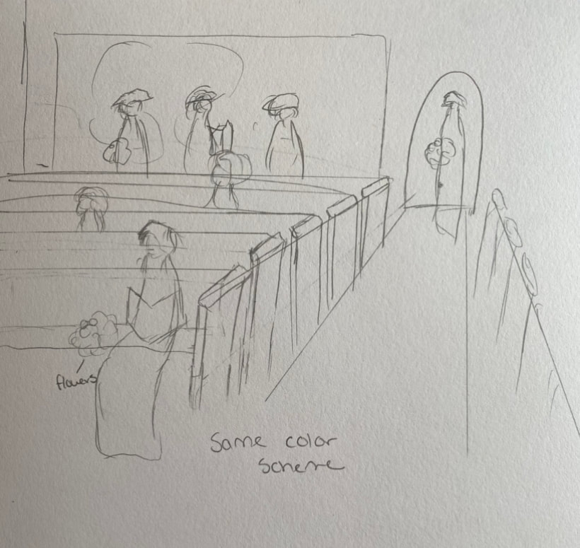 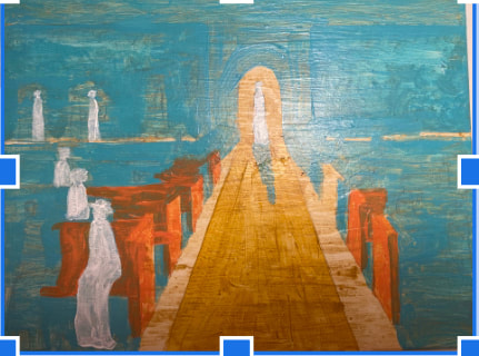 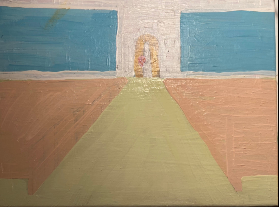 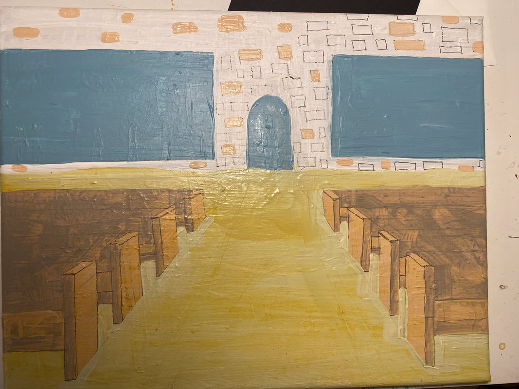 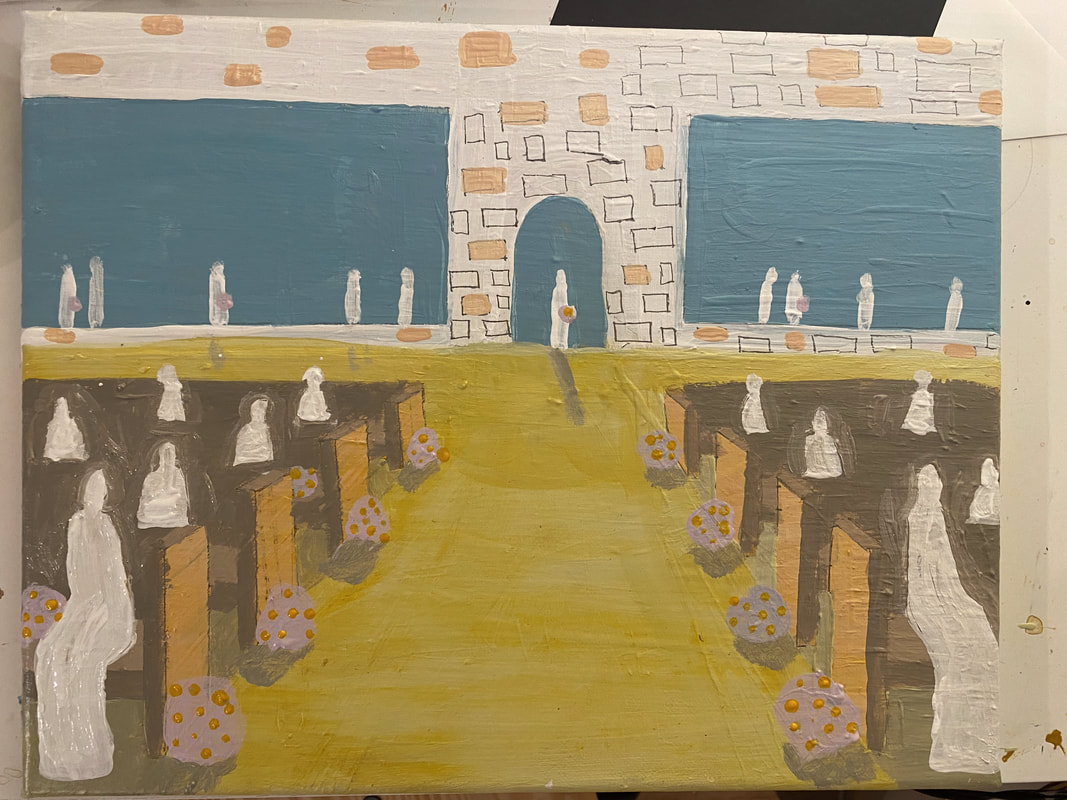 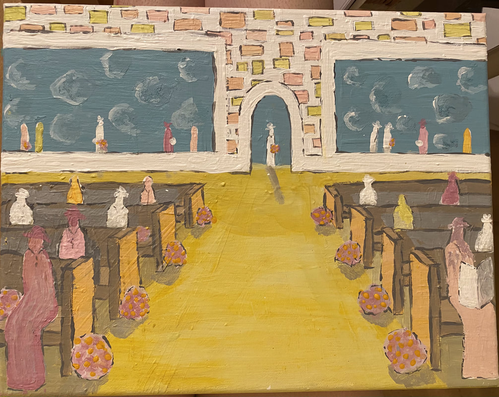 Final Piece
Brainstorm Ideas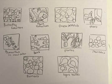 In Progress
Final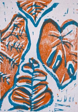 -DESCRIBE
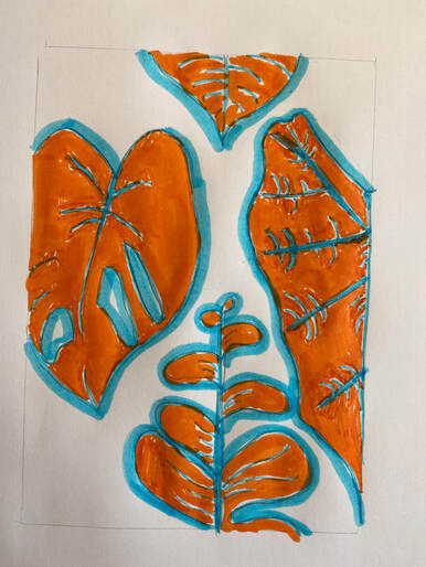
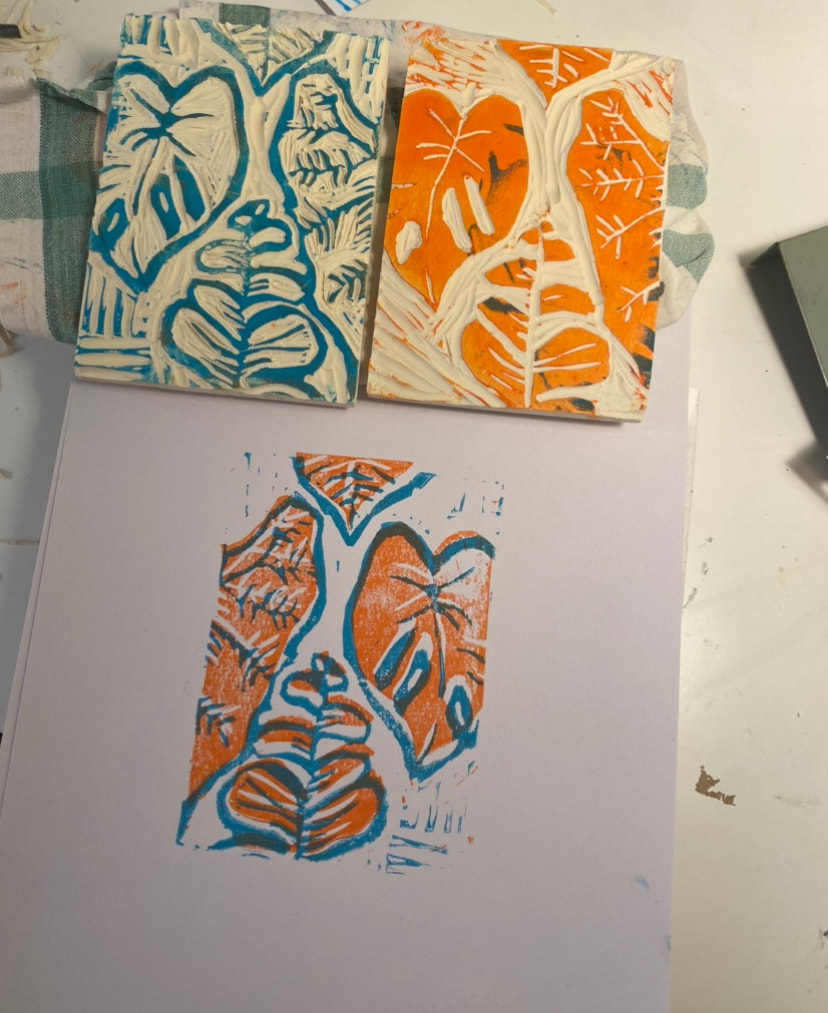
Describe your piece as if you were on the phone with someone. Explain what it is. My piece uses orange and blue layered and not lined up completely. There are four types of tropical plant leaves in the picture and they are going off of the page. The leaves have texture lines and outlines with the blue and the rest is orange. The piece represents a collection of plants. -ANALYZE How did you use line and contrast in your piece? I used line and contrast in my piece through the colors and their placement. I used the darker color, which was blue, to do the detail work such as the lines on the plant and outlines to make the leaves pop. The orange was the base and filled in the white space on the leaves. -INTERPRET Why do you feel the subject and what you made represents the theme? Does the printmaking process help show this? I feel as though my piece represents the theme of collection because it represents a collection of tropical plants. When I think of collection I think of a group of similar but yet different things and that is why I chose the different leaf types and textures. I think that the printmaking process in my case did not help to show the theme because I basically had the same layout on both linocuts but in a different order. -JUDGE How do you feel about your piece? Do you feel your piece is successful? Why or why not? I like my piece and I do think it was successful. It is not my favorite piece, but I think that it was successful in relating to the theme of the project. I originally was not going for the look of it being off centered, but I actually think that it adds to the piece and looks better that way. I also think that you can tell what my piece is which also makes me feel as though the piece was successful. I do wish that I could have added more detail, but it was really hard to get fin detail with the linocut. Reference Photo Options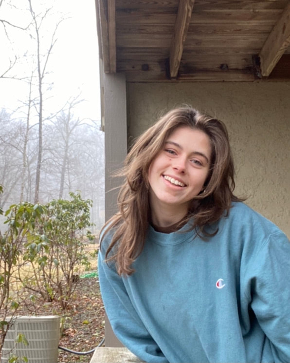  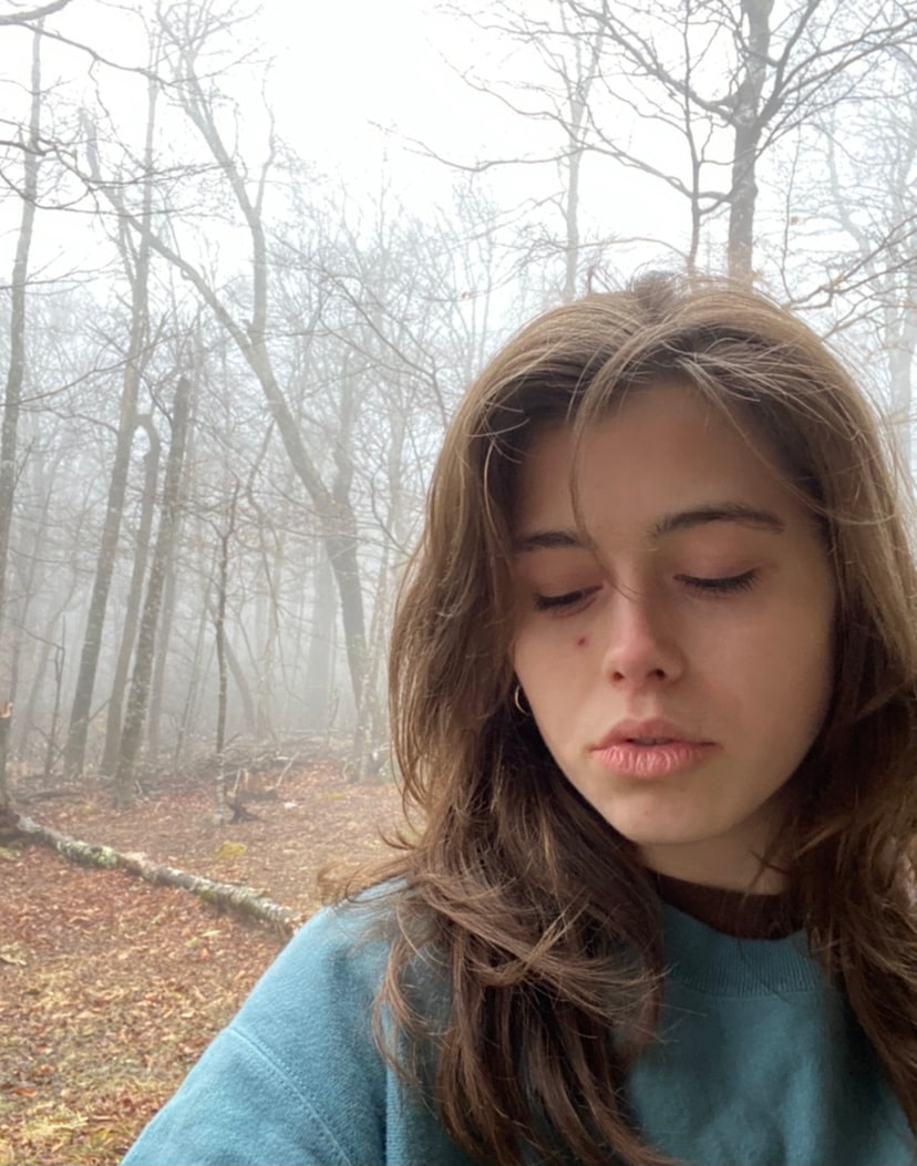 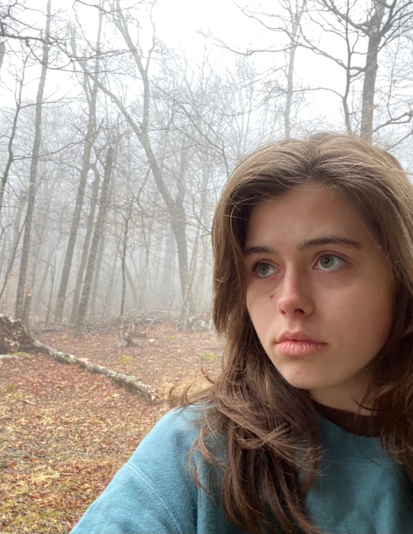 Color Testing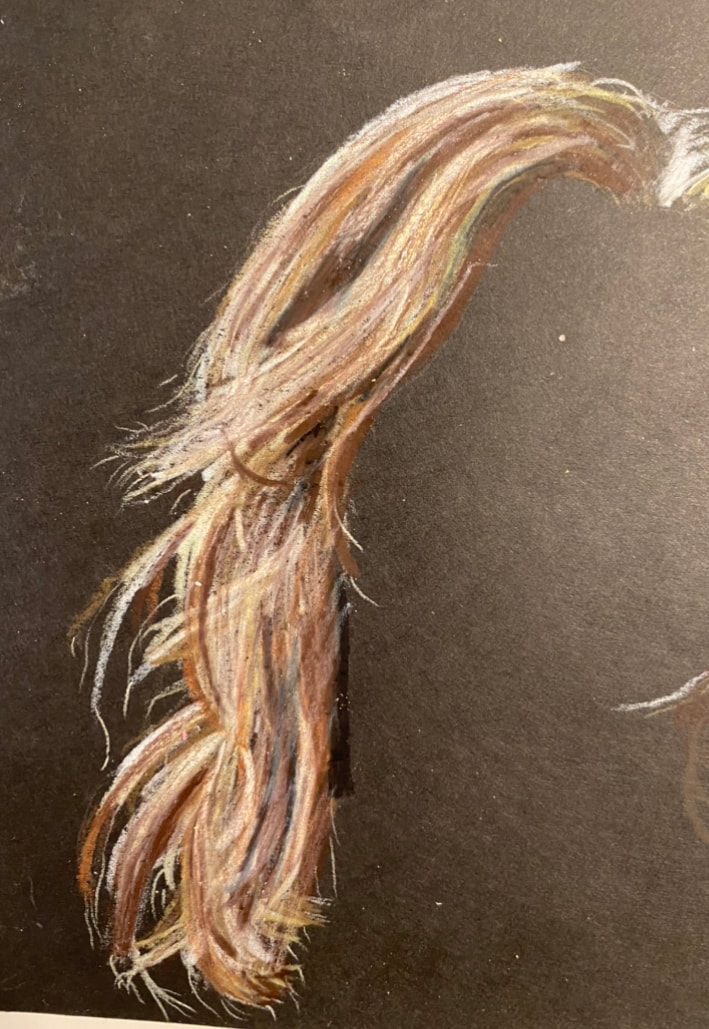 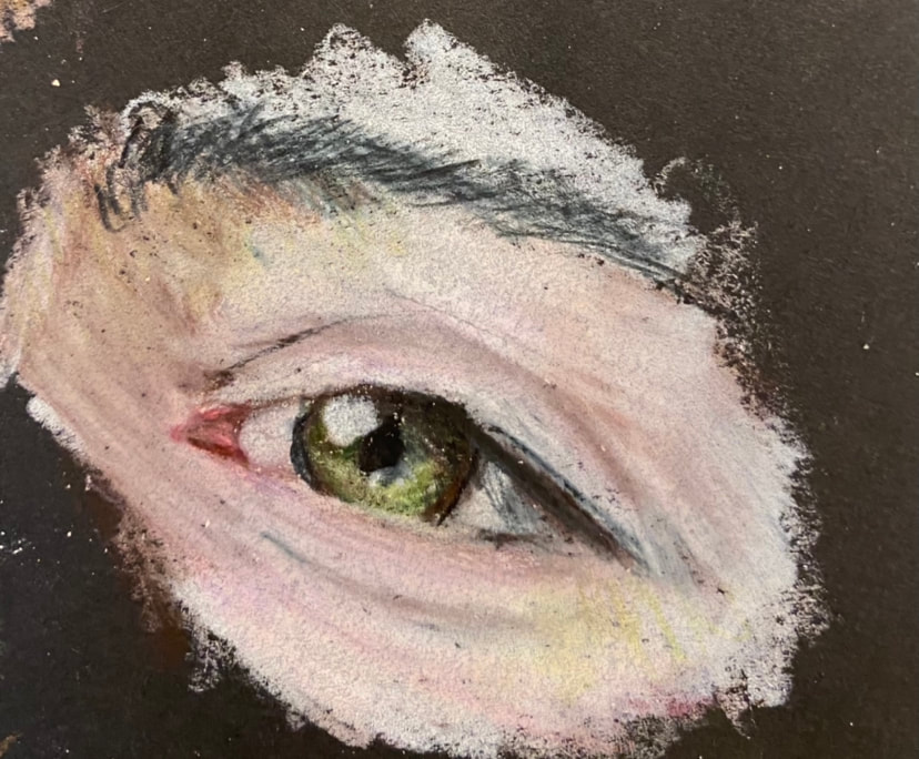  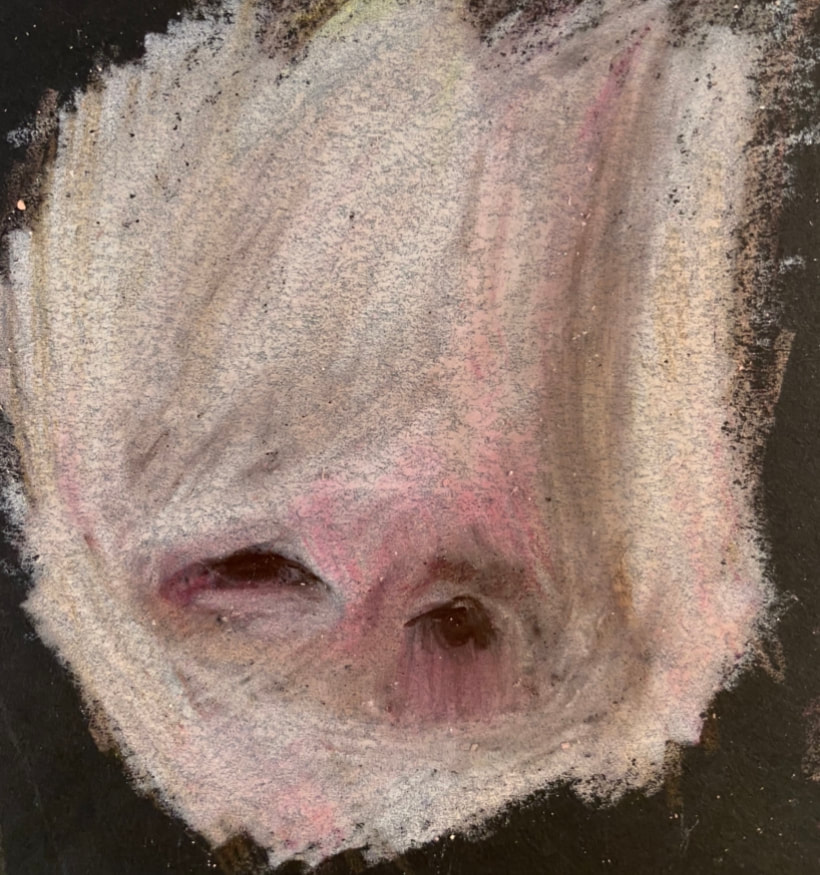 In Progress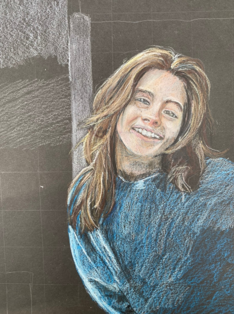 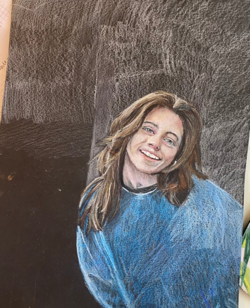 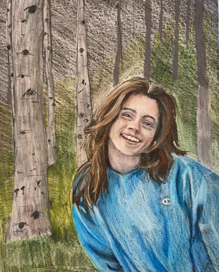 Final Describe: Describe the image you drew. How would you describe it on the phone? (2+ sentences)
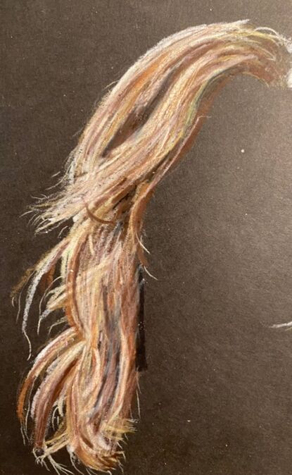
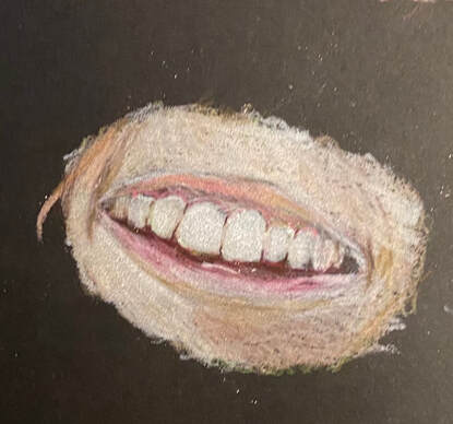
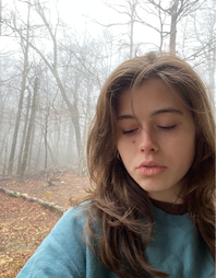
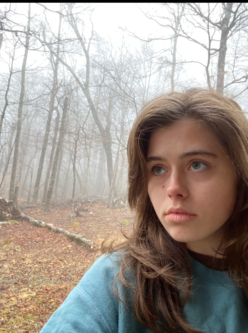
I would describe my image as a colored pencil portrait of me in a forest of birch trees on a fogy day in the mountains. I am smiling and peeking into the photo from the right. The image is smooth and light and there is not to much definition of the shadows. Analyze: What principles and elements of design are used in this piece and how? (The elements of art are color, form, line, shape, space, and texture. The principles of art are scale, proportion, unity, variety, rhythm, mass, shape, space, balance, volume, perspective, and depth. ) In my piece I use texture, color, proportion, balance, and depth. I used texture in parts such as my hair and the grass to make it look soft and fluffy. I also used texture in my skin to create a smooth soft look. I used proportion in my face in order to make it look like me and look human. I used balance using the tree to balance out my body and the background. I also used depth with the fog in the background and the size of the trees as they go back.. I finally used color by adding green grass as my background to complement my blue sweatshirt and my hair. Interpret: How would you classify your style in this piece? How did you show meaning in your piece and your voice as an artist? I would classify my style in this piece as elegant and bright. I showed the meaning of my piece through the background. I created an eerie background that was very mysterious and almost creepy. This was in order to show that the past year has been similar. It has been a mysterious and disturbing year. I am smiling in my piece to show that I moved through it even though it was hard and I made the best of 2020. Judge: What do you find successful about your piece? What might you change if you were to do it again? I feel like I was successful at making me look like me and I also think I did a good job of creating a background without a reference. I would however change my position in the piece and make me move up more so that you can see the details in my face. It was really hard to get all of the details because of how small my face was in the image. Overall, I am really happy with how it turned out and I feel that my piece was overall successful. Composition Photo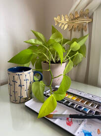 In Progress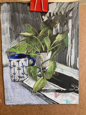 Final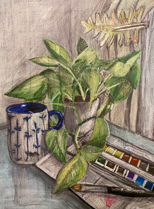 Describe: What items are included in your still life?
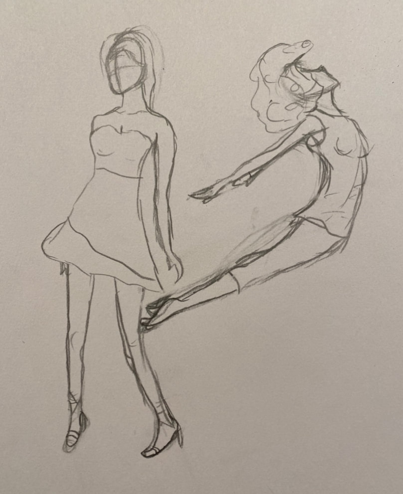
The first thing I included was a blue patterned mug with a tea bag inside of it. I then added a vine plant with its pot. The third item I added was a watercolor palette and brush. In the background I also added some elegant curtains held by a metal leaf. Analyze: How does the viewer’s eye move around the piece? The viewer's eye moves around the piece using the Golden ratio method. Your eye begins at the plant and makes its way around to the leaf holding the curtin. The spiral movement of the piece makes it interesting. Interpret: What does each item represent? What medium did you pick and why? The mug with tea represents my favorite drink which is just plain tea, I drink it everyday. The plant represents my love for nature and plants. My room is covered in plants and little representations of nature such as the leaf curtain holder in the image. Lastly, the watercolor set and brush represent my favorite medium and pass time. I have always loved painting in watercolors and recently started taking commissions for them as well. I used colored pencil because I wanted my piece to have color in it and not just be black and white. I also love using colored pencils even though they are not what I am best at. Judge: Do you feel like your drawing is a good representation of who you are? I think that this drawing really represents me. It includes my interests and the color shows my bubbly personality. I think that the use of colored pencil really helped this piece better represent who I am. I also love that the layout of the objects is not precise, which I also think represents me in the way that I love using a looser style of art rather than a strict confined style. Day 1: Foreshortening
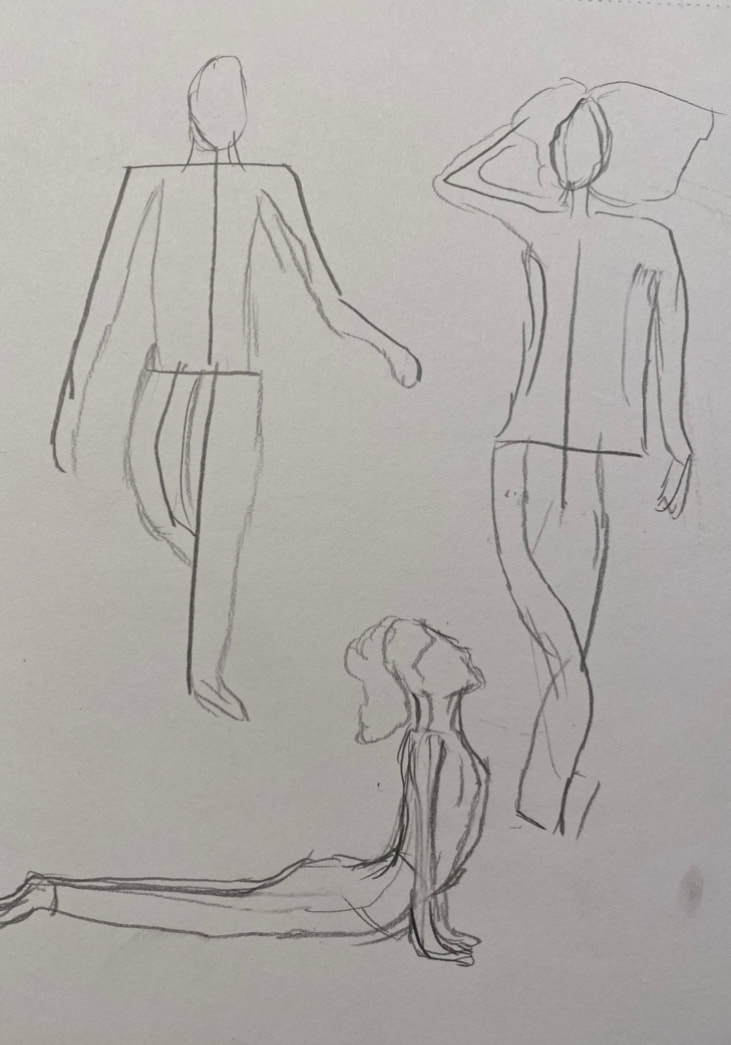
Day 2: Proportions
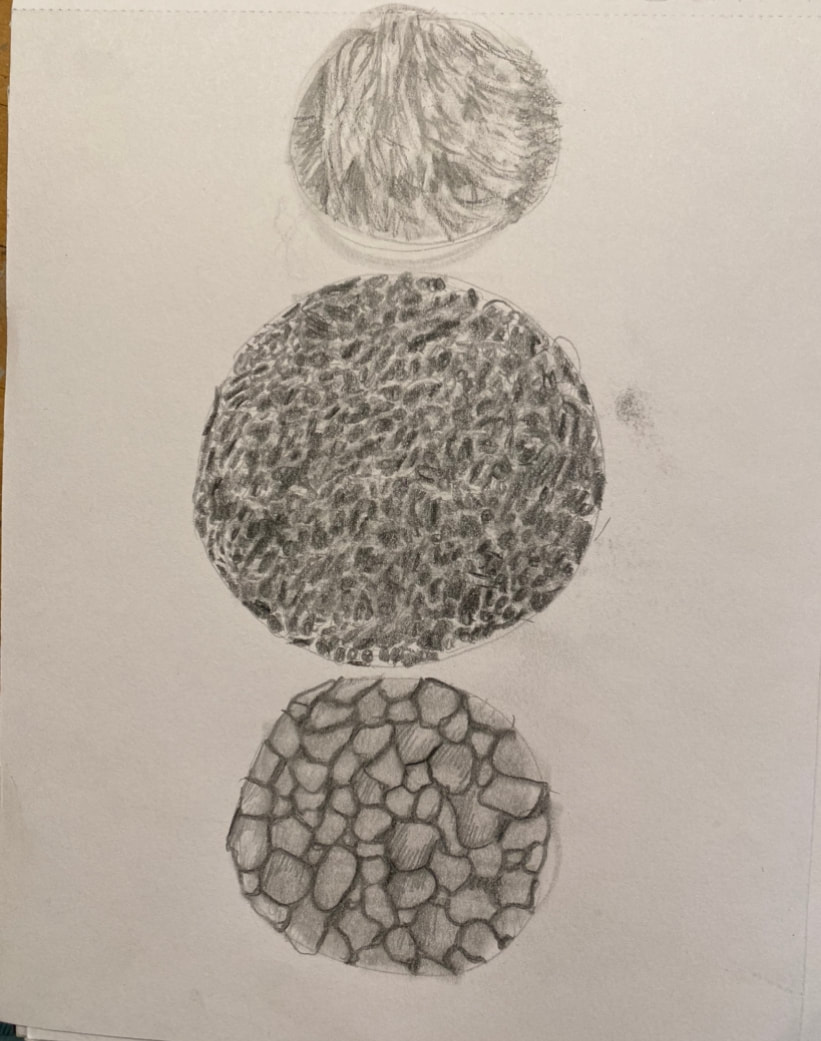
Day 3: Texture
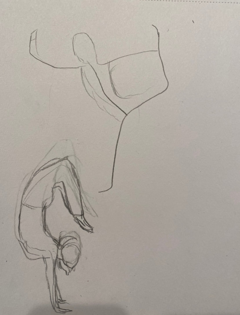
Day 4: Gesture
Sketches
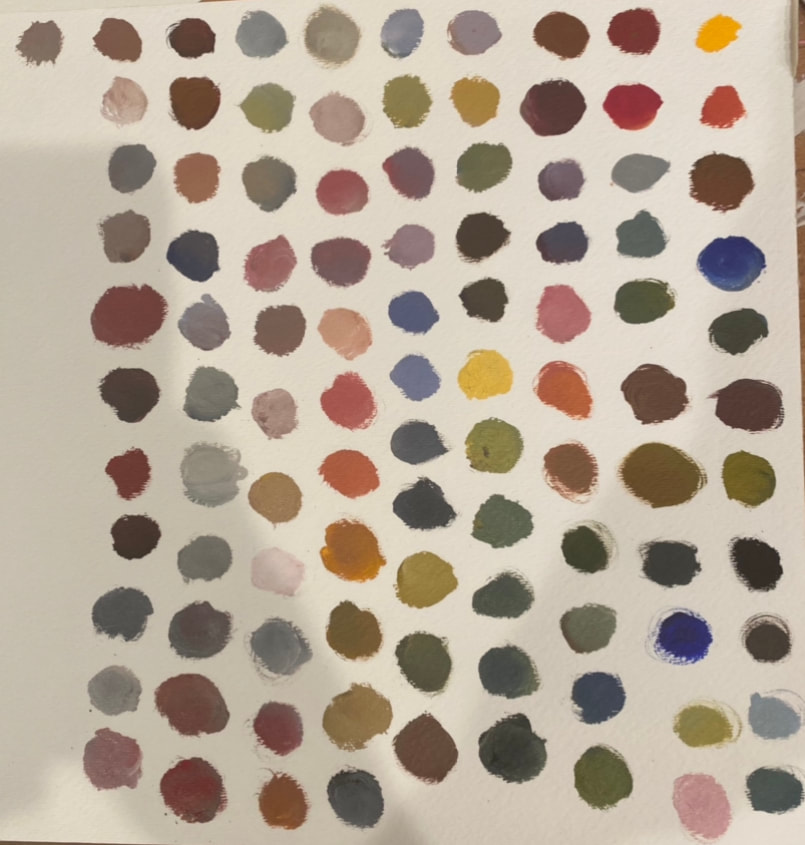
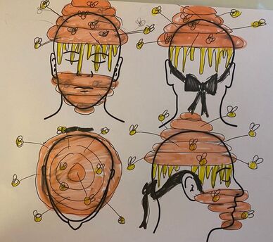
Experiment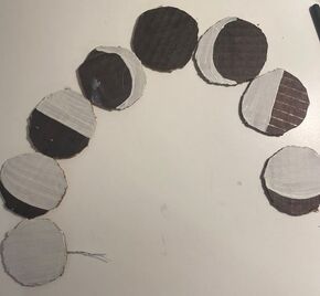 I did multiple experiments, but the one shown above was for the moon phase part of the design. I started off just trying painted and cut cardboard and this ended up not working because it looked sloppy and the colors where to distracting. I then tried to do paper mache, but this ended up looking messy to and not what I was going for. I eventually ended up using binder rings, wire, and hot glue to create the moon phases. In Progress
Final
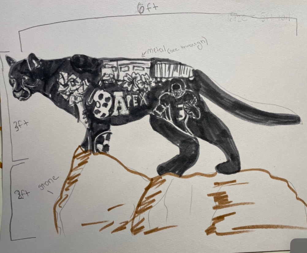
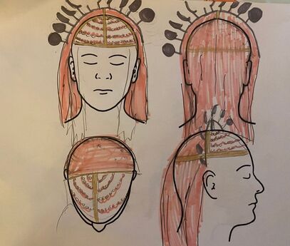
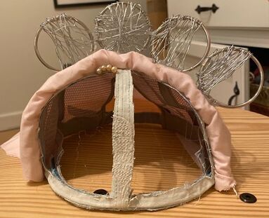
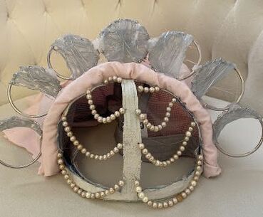
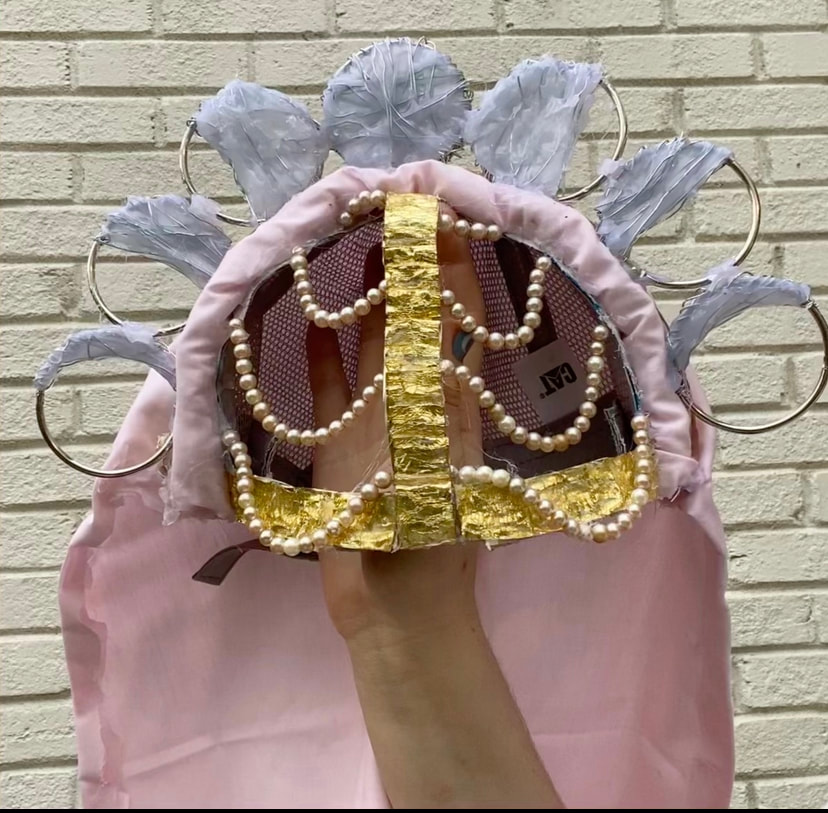
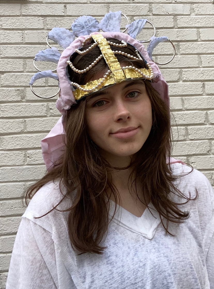
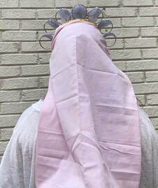
DescribeMy piece is overall based off of the moon phases and a mediterranean style headpiece. I created my piece with a baseball hat in which I cut off the front section and left two holes in order for me to be able to do bead work. The beads loop down the front of the hat and are connected with a strip of ribbon attached to the center of the hat. On the top of the headpiece are the moon phases which wrap around the wearers head. Down the back of the headpiece there is a light pink vail and a gold rim on the top of it which secures it to the hat. InterpretThe mood/feeling of my piece is medieval and happy. The bright colors on the piece give it a happy feeling. The piece not only reminds me of medieval times, but also Star Wars in a way because there is a similar hat in that movie. Overall, I think that my piece creates and elegant and happy mood to the viewer. AnalyseI feel like I did a good job balancing my piece and making it all work together with a smooth transition. It gives off the outer space vibe that I was going for without being to bold. The gold complements the silver on the moon phases and the pop of color helps to bring the piece together. It is a good balance of color and neutrals. JudgeI feel like my piece was successful. It looks almost exactly like my sketch which is what I was going for. It actually turned out better than I thought it would and I felt like I was able to find the best way to put my pieces together to create this. I love how simple the piece is but, it still has just enough going on in it to make it interesting. The only thing that I would change is filling in the moon phases with hot glue because I feel like I lost some of the elegance of it by doing this.
What was the most challenging part?
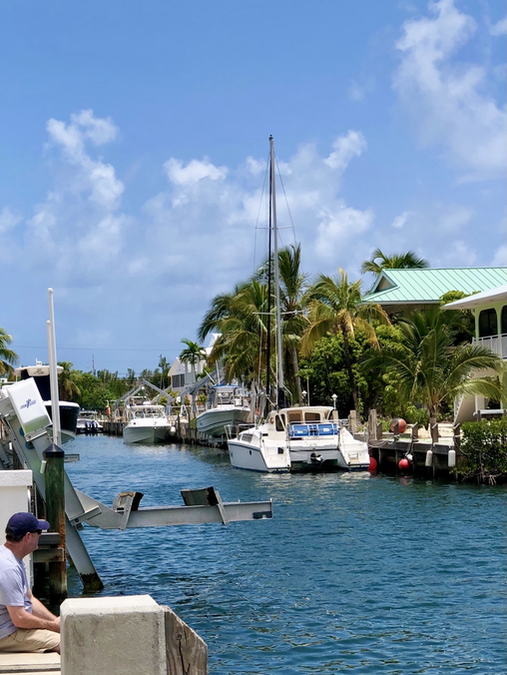
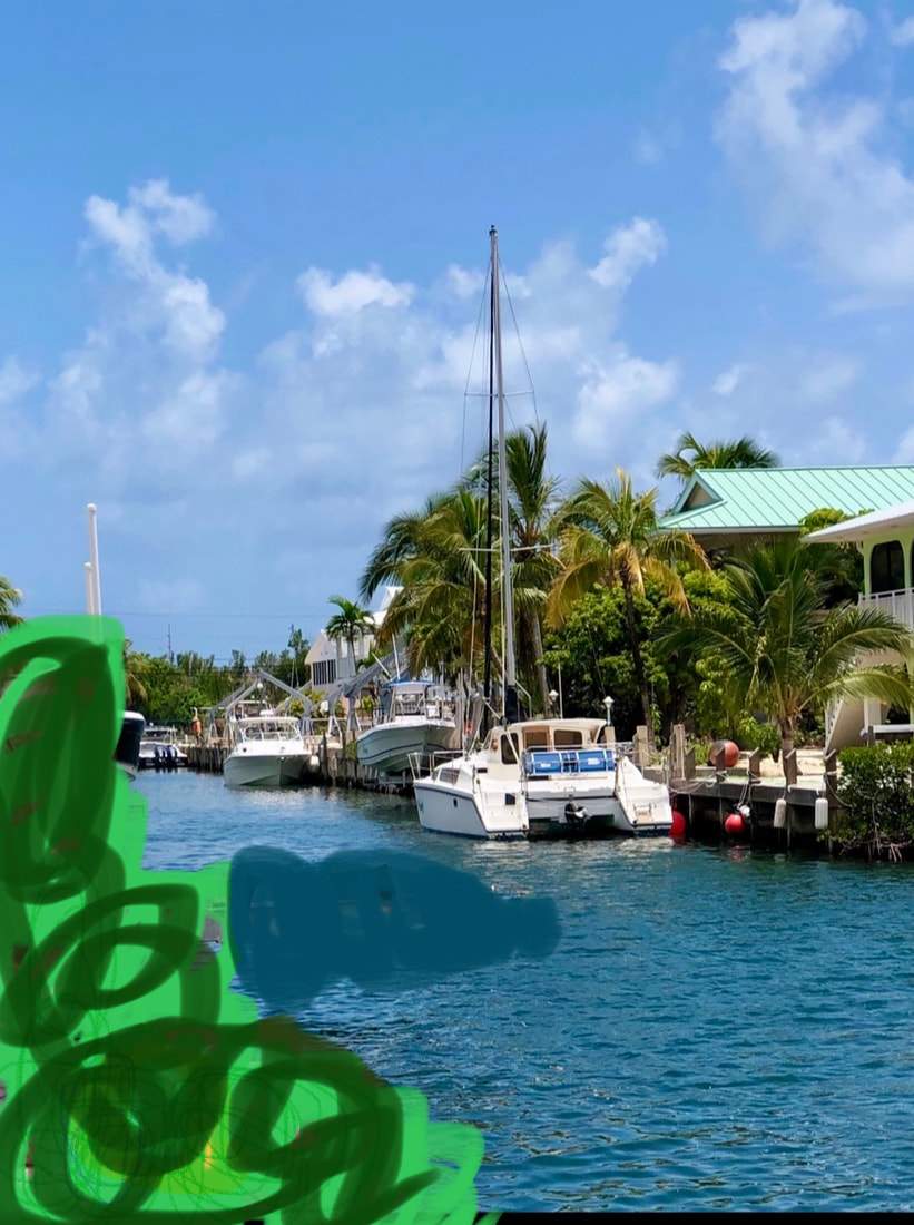
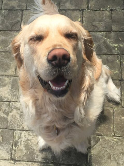
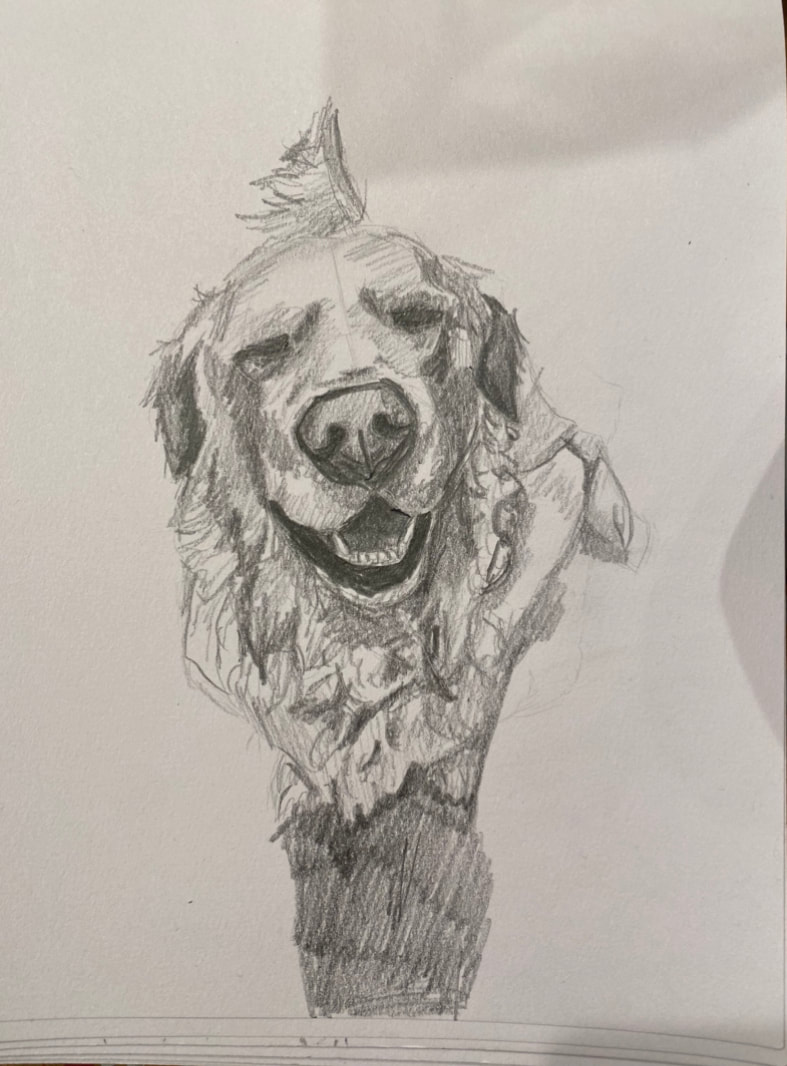
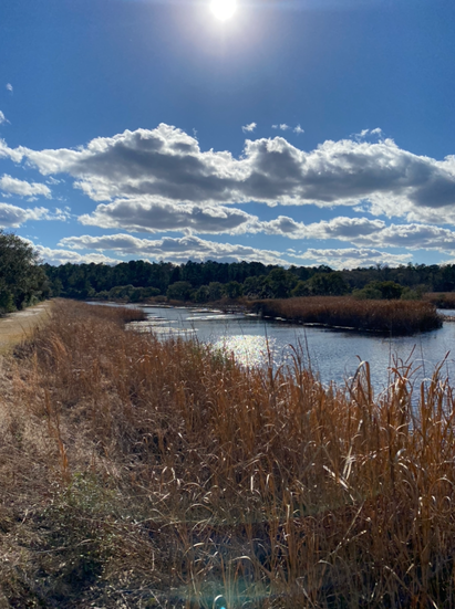
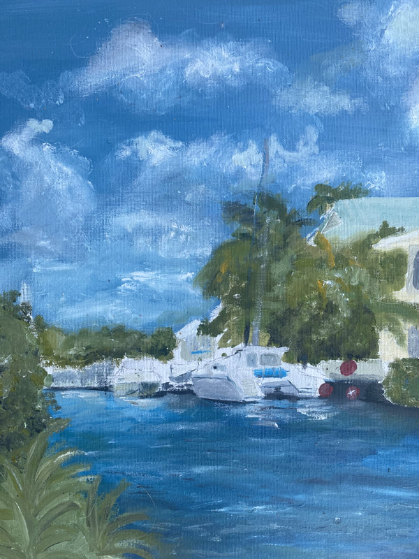
The challenging part was finding the right colors to use in the piece. It was also hard to create texture which I don't think I did very well. Why did you choose to do the imagery you did? I chose the imagery I did to show the texture of the trees and the clouds. I also used a smooth texture for the grass to draw attention to the water instead.  An interesting thing about me.... - My dog had 10 puppies in 2020 and we kept one of them. I now have two dogs named Georgia and Scout.
A thing I am good at.... - I am good at painting in watercolor. I have been painting in watercolors for 3 years and have improved so much and I now paint portraits of peoples pets. Something I would like to learn this semester... - I would love to learn how to make any kind of pottery this semester. I have done it before but would like to learn more. |