|
Throughout this class I was able to expand my artistic ability so much! I loved learning how to use different mediums that I had not used before and I loved expanding my knowledge on mediums that I had used before. I learned different techniques in oils, acrylics, and colored pencil. My favorite project that we did was the self portrait project. I loved getting to try a new style of art and reflect on myself in the piece. I loved the way my self portrait turned out and I think that it showed a huge improvement in my ability to paint with acrylics. This piece also made me love acrylics and I have used them a lot more since then. My least favorite project was the landscape project in oils because I just don't like using oils. I don't like the way the oils feel on the brush and how they blend. Oils also take way too long to dry. All of the practice pieces that we did also helped me to learn how to do different things and helped me to improve. I got to practice using the medium on the practice paintings before the final piece and this gave me the ability to get used to using the medium. I overall think that Art 4 helped me so much in my artistic ability and my knowledge. I hope to continue to use the things that I have learned in this class throughout AP Art and in the future.
0 Comments
Ideas and ReferencesColored Sketch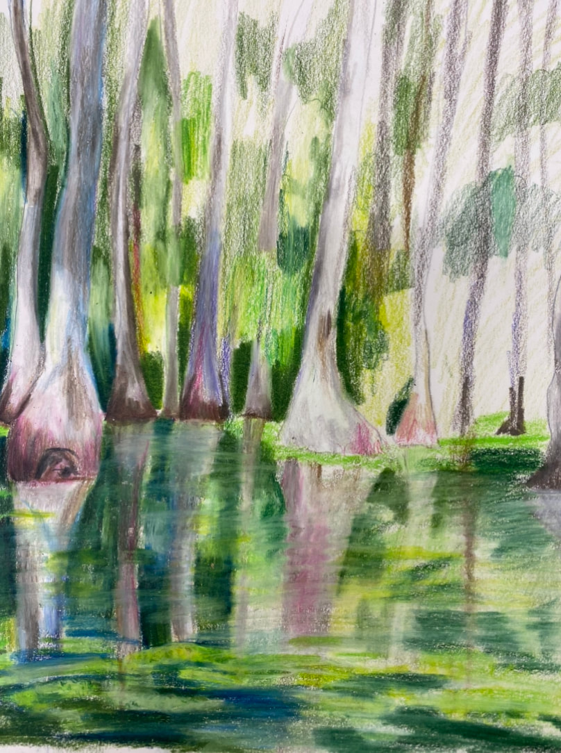 In Progress
Final
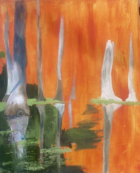
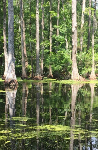
ReflectionFor this project we had to choose a landscape image to paint. The painting had to have color and interesting elements. I wanted to chose an image that held a memory. I chose a large group of photos and narrowed it down to four photos. I ended up picking an image from a swamp in Charleston. I did a colored sketch of the image to layout were all of the different colors and elements would go. I then took a canvas and painted on a wash of red orange acrylic paint. After the acrylic layer was dry I sketched out the basic shapes. I then began coloring in the basic shapes of the colors in the painting. It was really hard not to overblend the oil paint. I kept adding layers to make spots that had gotten to muddy look better. All of the small details were added last. Oils are not my favorite medium. It is really frustrating when all the colors over blend and also I did not like how slow it took to dry. At the beginning of the project I was still getting used to the medium and was struggling with getting straight clean lines. While I am still not the best at oil painting I think my ability improved towards the end of the project and I eventually got the feel for using it. This painting had so many different colors and elements in it that it was difficult to get everything in. I overall am happy with the way the painting turned out and I definitely think I have grown in my ability to use oils. Pallet Knife Painting Practice with Oils This painting was a practice painting using a pallet knife. This technique is easier to me than using a paint brush but, it does not give you realism. It is hard not to over-blend your colors and I did towards the middle of the apple. I loved how the painting did not need to be perfect with this technique. Oil Practice Painting (unfinished)  This was a practice painting using oils. I had a hard time blending my colors and shading my piece. I found that it was my brush that was the issue. I was able to blend it out a little more and that made it look a little more realistic. I overall like using oils but they can get frustrating when you want to add layers. 100 Color Challenge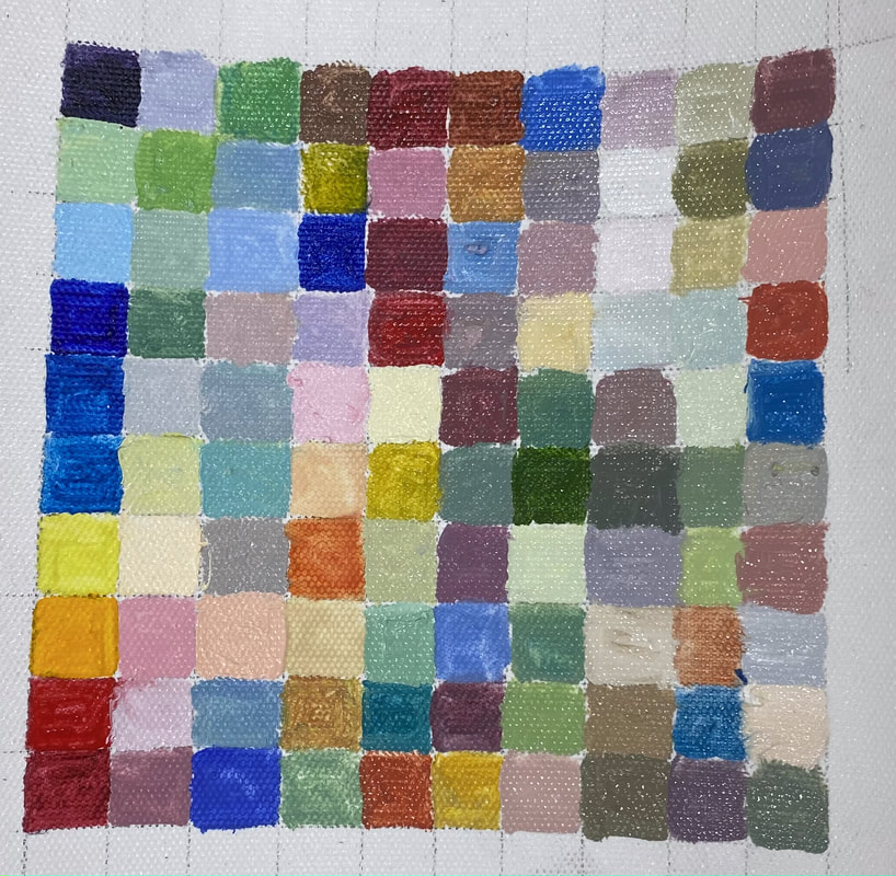 For this challenge we had to create 100 colors by mixing the oils. This took a lot longer than I expected!
References and Sketch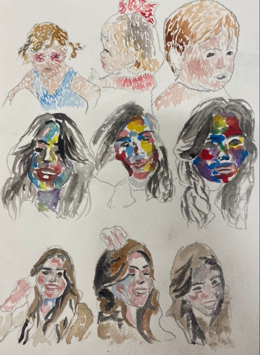 In Progress
Final
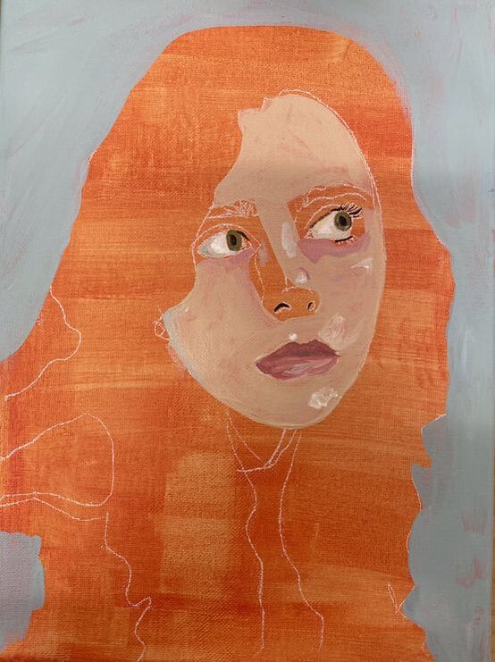
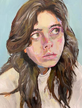
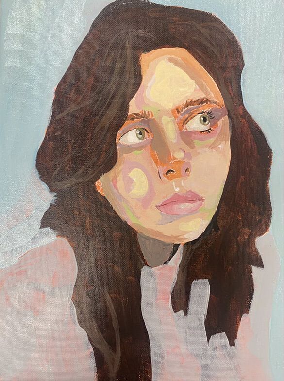
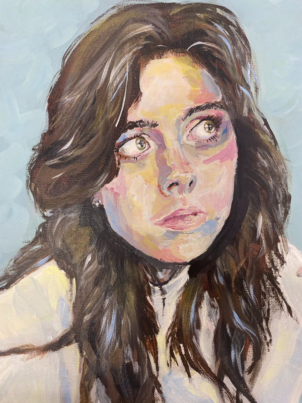
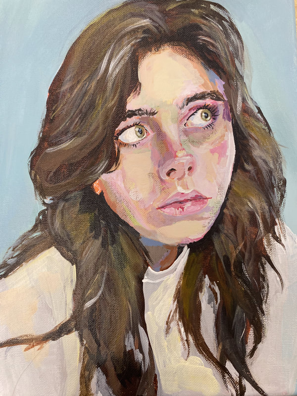
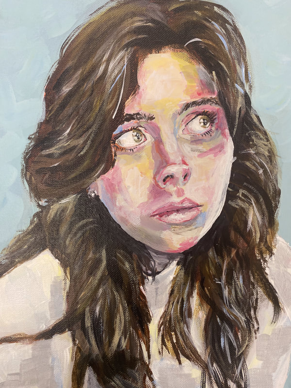
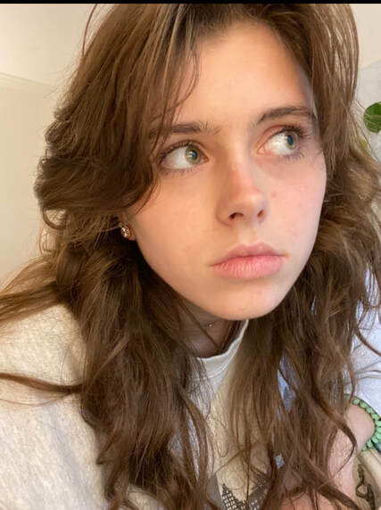
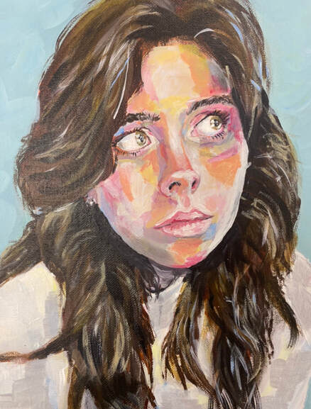
ReflectionI first started looking at ideas for the style I wanted my piece to be in. I loved the ones that had large brush strokes and lots of color. I created 3 different sketches for each style using a different reference photo for each. I ended up choosing my second idea which was more of a expressive style. In this style they used similar colors to the reference but exaggerated them and did not blend them out. I started my piece by doing a orange wash on the canvas. After this dried I sketched out my reference on the canvas. I started the skin by just having one color on it and then I kept adding more layers. Each layer did not bled into the other one there for creating the expressive style. I added different colors that were not noticeable in the reference such as blue and purple. I had trouble getting the shape of my face to the correct proportions. I also had the same problem with my mouth. I ended up using pictoart to overlap the two and find out what I was doing wrong. I still think that my painting is a little bit off but it looks better then how it did before. I really liked working with acrylics, especially with this style in particular because I did not have to blend. I love how the colors turned out on this piece and I also think that they eyes turned out really well on this piece as well. I learned not to get to caught up in the details through this project. I kept trying to fix little things and it ended up making more work for me and it ruined things that were fine as they were. Next time I do a piece like this I need to make sure that I keep all of my proportions exact throughout painting so that I don't run into trouble with it later. I really like the way that this piece turned out and I hope to do more with acrylic in the future. Colored Pencil PracticeEye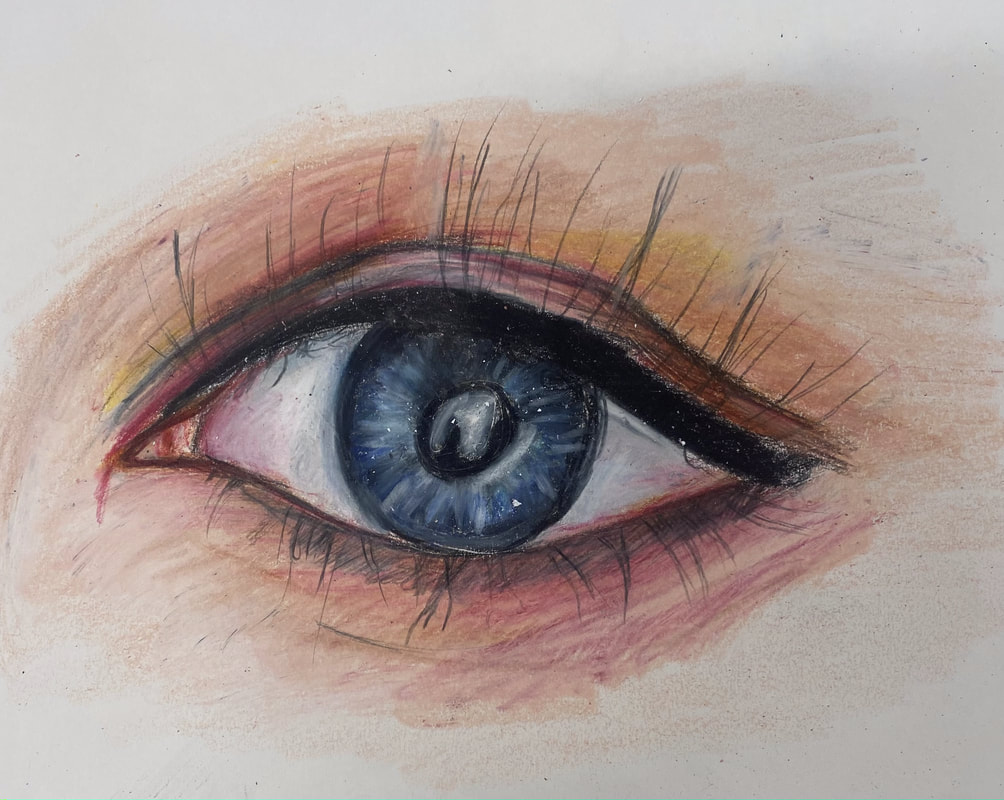 This eye was done as practice in colored pencil. I followed a video tutorial and learned how to properly create an eye. Nose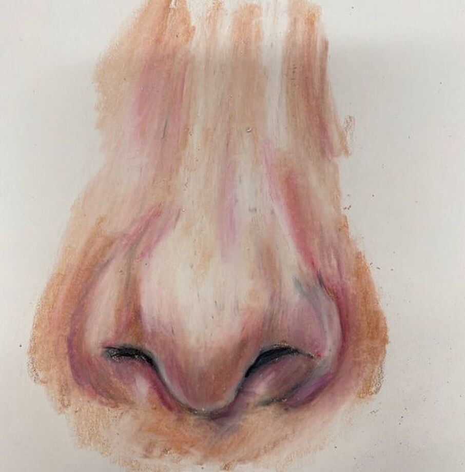 This nose was done in colored pencil as a practice piece. I followed a video tutorial step by step. Mouth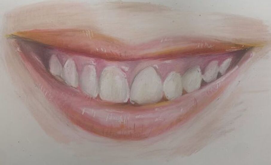 Practice mouth done in colored pencil. I used a step by step video to help me learn how to draw a mouth correctly. Face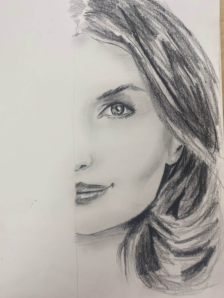 Using a video tutorial I created this practice in pencil in order to practice more of the proportion techniqes. Proportions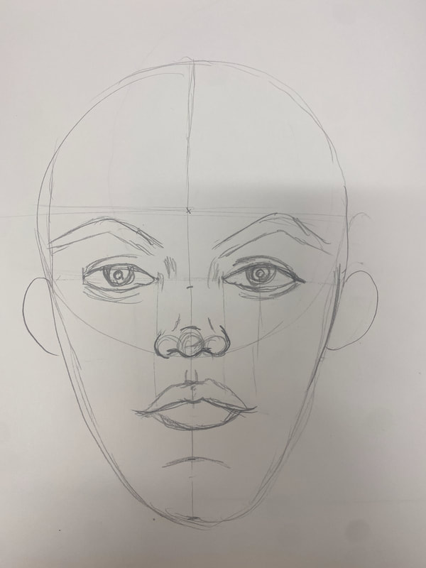 I watched a video on the proportions of the face and read through a step by step. I followed the steps and measurements and created this face. I learned how to measure each part of a face and place it in the correct spot. Paint PracticeSkin Colors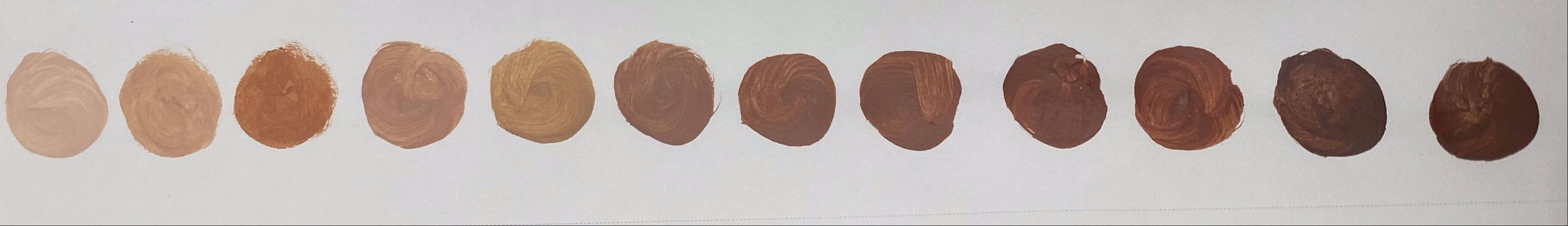 We had to create 10 different skin tones. This practice helped me learn how to mix colors to create a skin tone color and how much of each color can create which shade. Eye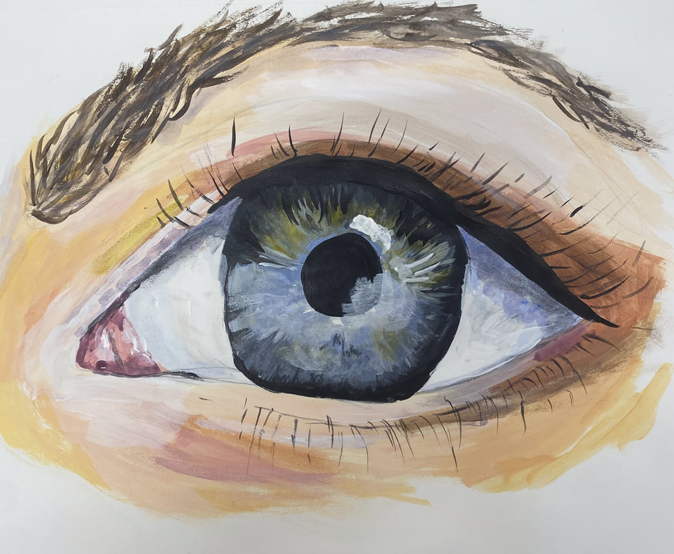 This piece was done in acrylic and was done by following a step by step tutorial. This helped me learn how to properly blend out the colors and create a proportional eye.
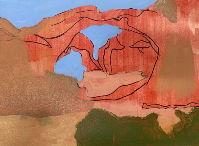
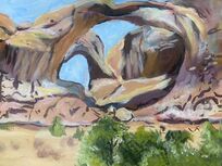
Ideas and References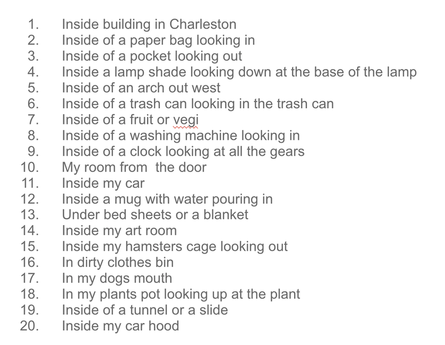 I made a list of 20 ideas and chose two of my favorites. My first idea was being inside a state park. The images were from the Arches state park when I visited. My second idea was inside buildings in downtown Charleston. I took the reference images on a trip to Charleston a few years ago. Colored Sketch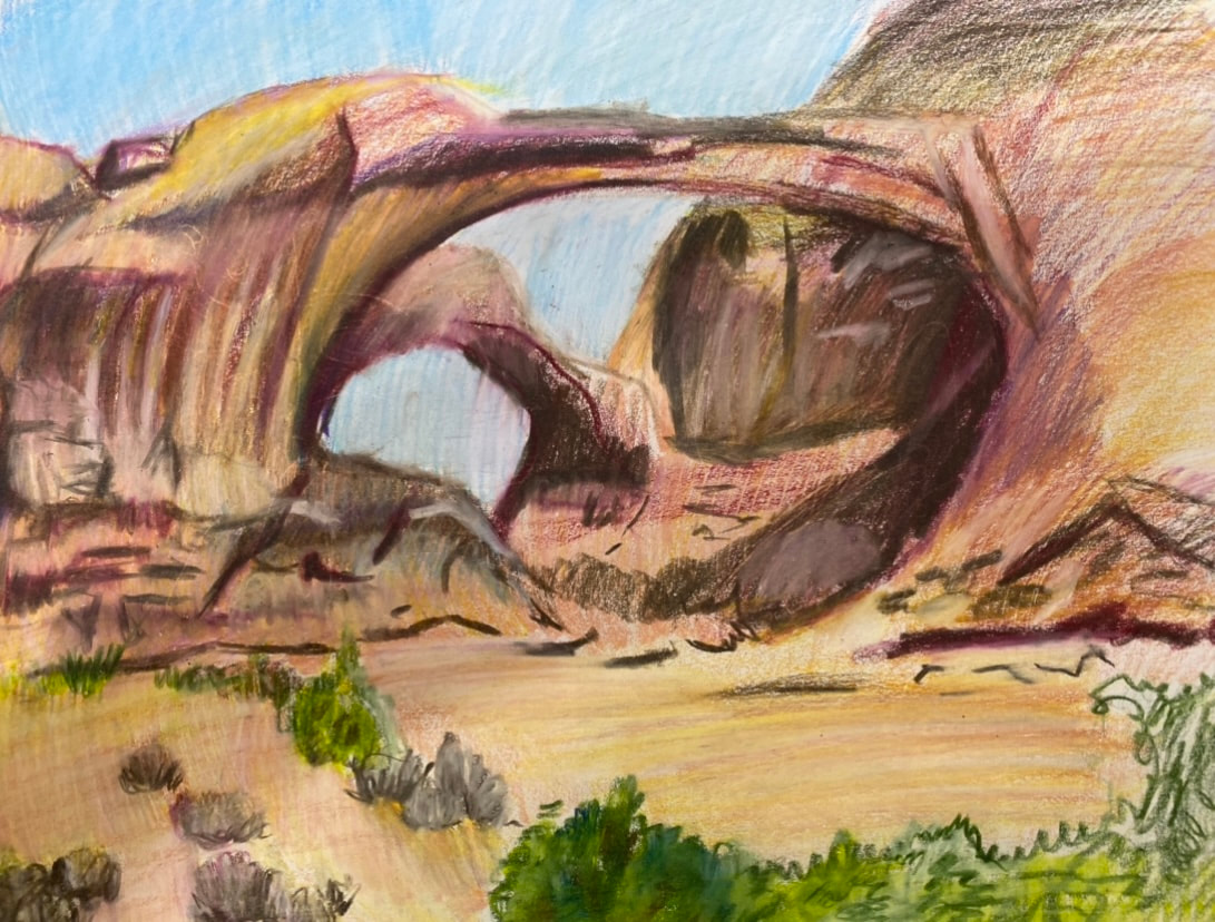 I ended up choosing the inside a state park idea. Mrs. Rossi helped me pick the image that I should use for my final and I began a colored sketch in colored pencil. I tried to add as many colors that I could see into the colored sketch so I knew how to achieve the perfect look for my final piece. In Progress
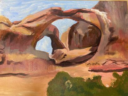
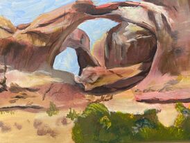
Final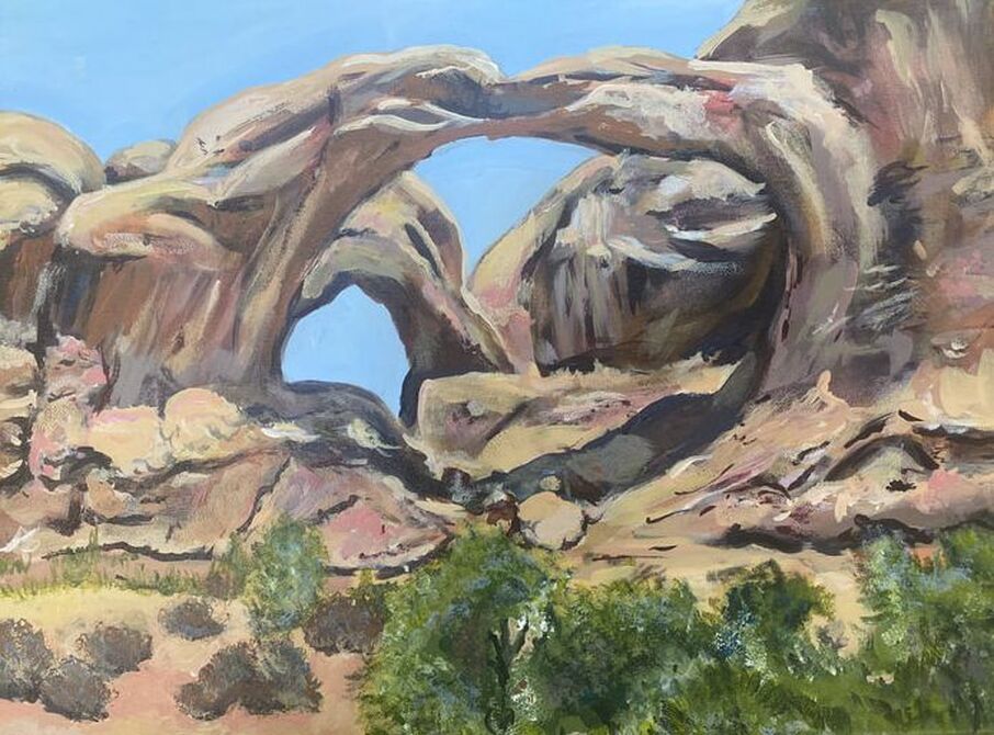 ReflectionI first brain stormed what I wanted to do for the theme of Interior Spaces. I came up with a list of 20 ideas and narrowed it down to inside a building in Charleston and inside the Arches State Park. The state park references were more interesting and the colors were really bright. This caused me to lean more towards doing the State park photo. Out of all five of my references for this idea I ended up picking the one that had arches that you could go under or "inside . I think that this idea also made my piece fit with the theme more. I then did a color sketch of my piece and picked out which colors that I would use for it. I then started my piece by placing a wash of red orange all over the canvas. I then laid out all of the colors with one layer of paint on top of the orange layer. I began adding shading and more colors as I went. I made different textures to the piece such as using a dry brush to make the leaves on the bushes. I add a hard time getting the grey bushes right. The color of them was really hard to make and I could not get them to look as realistic as I wanted. They still are not perfect but I think that they look better than before. Acrylic is really hard to blend and that was supper frustrating to me. I did however, like that you could add layers over mistakes and parts of the painting. This made it easier to fix some of my mistakes. Overall, I liked acrylic even though it was frustrating to work with at really hard to blend. I am also really happy with how my piece turned out! I love the colors in the piece and I love the way that the shadowing looks. I think that this piece helped me gain more knowledge in mixing colors. I feel like I have definitely grown as an artist because I got to experience a medium that does not blend well which was definitely out of my comfort zone.
In class we had to chose an image to paint in acrylic for practice. I started with a sketch and then layed out the different colors. Once I had all the colors layed out I added details with the black paint.
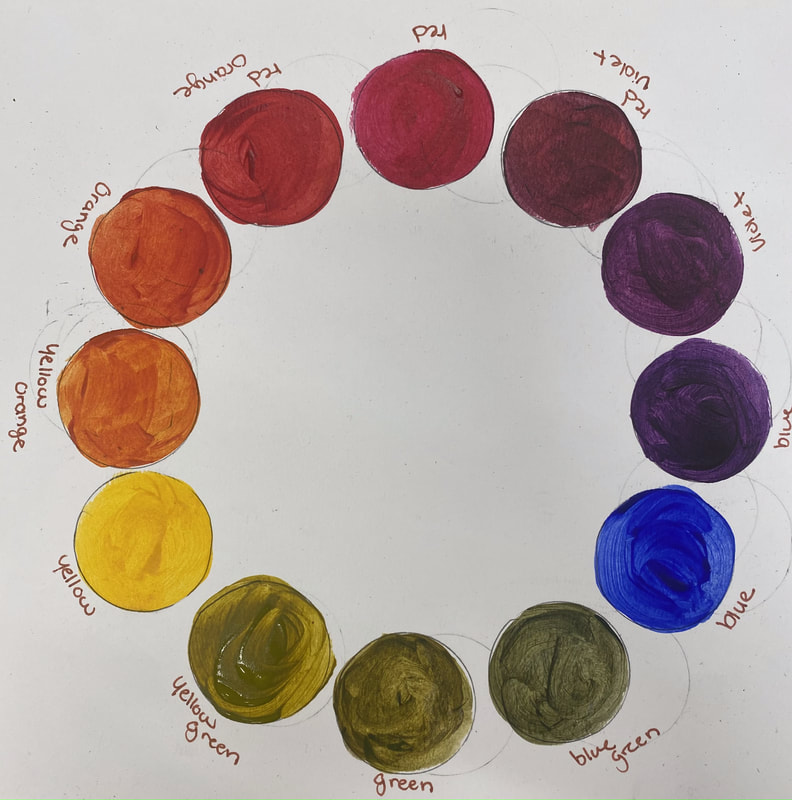
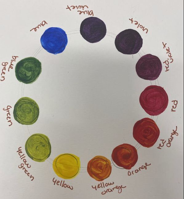
In class we had to make two color wheels only using the Primary colors. We had to make one of the color wheels with cooler colors and the other with warmer.
Brainstorming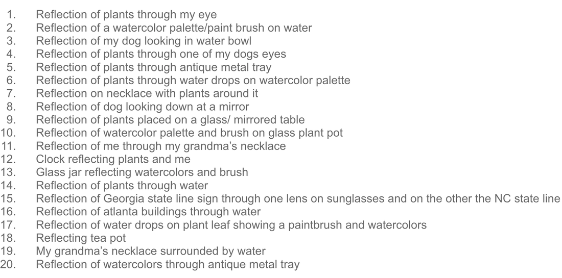 SketchesColor Sketch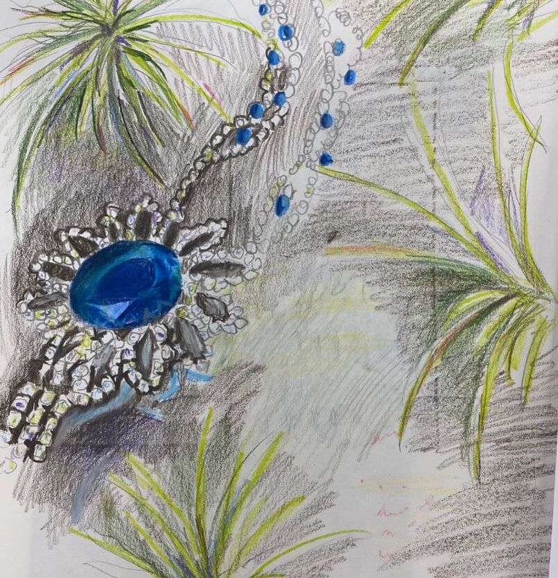 In Progress
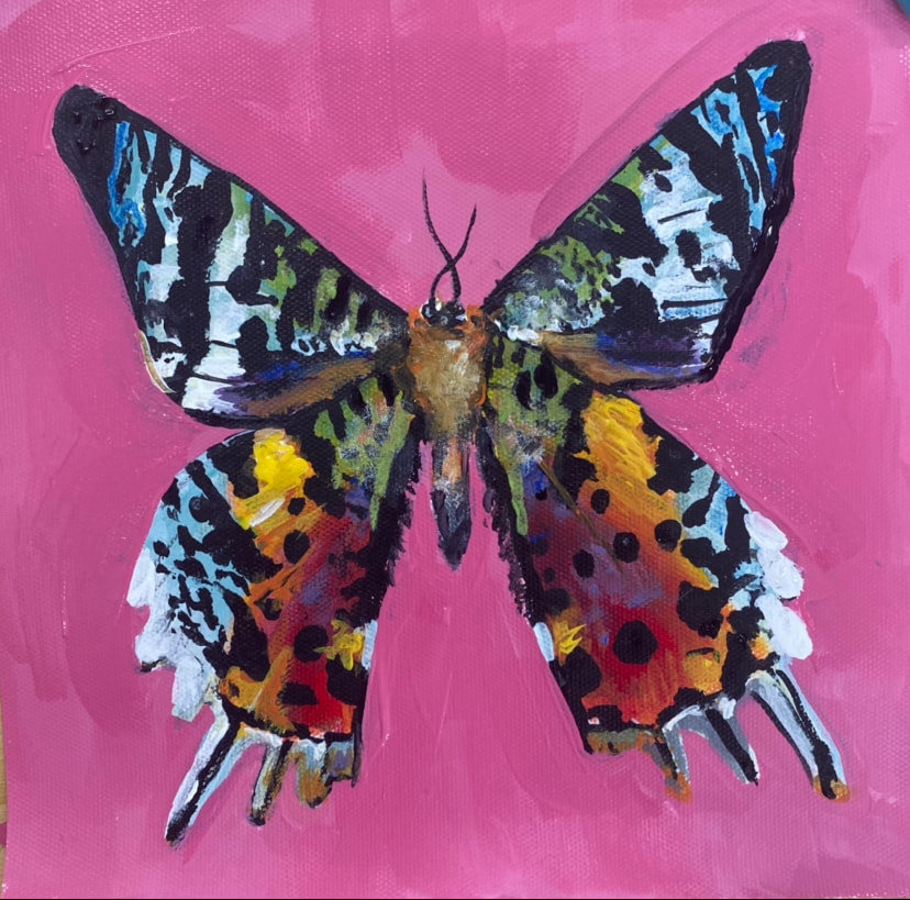
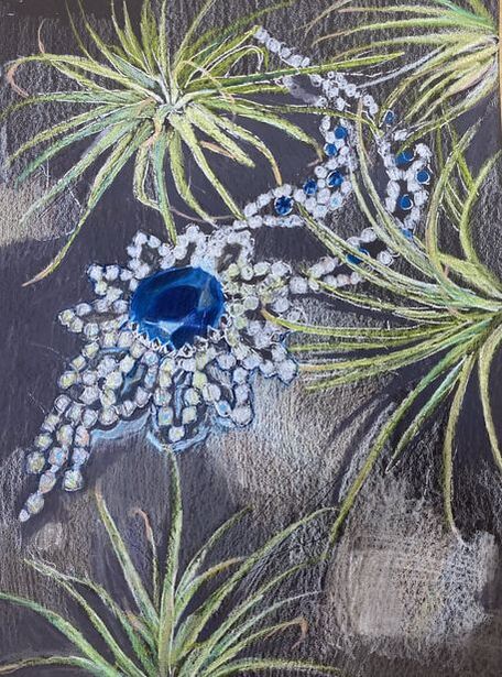
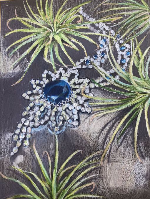
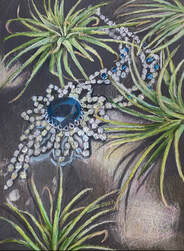
Final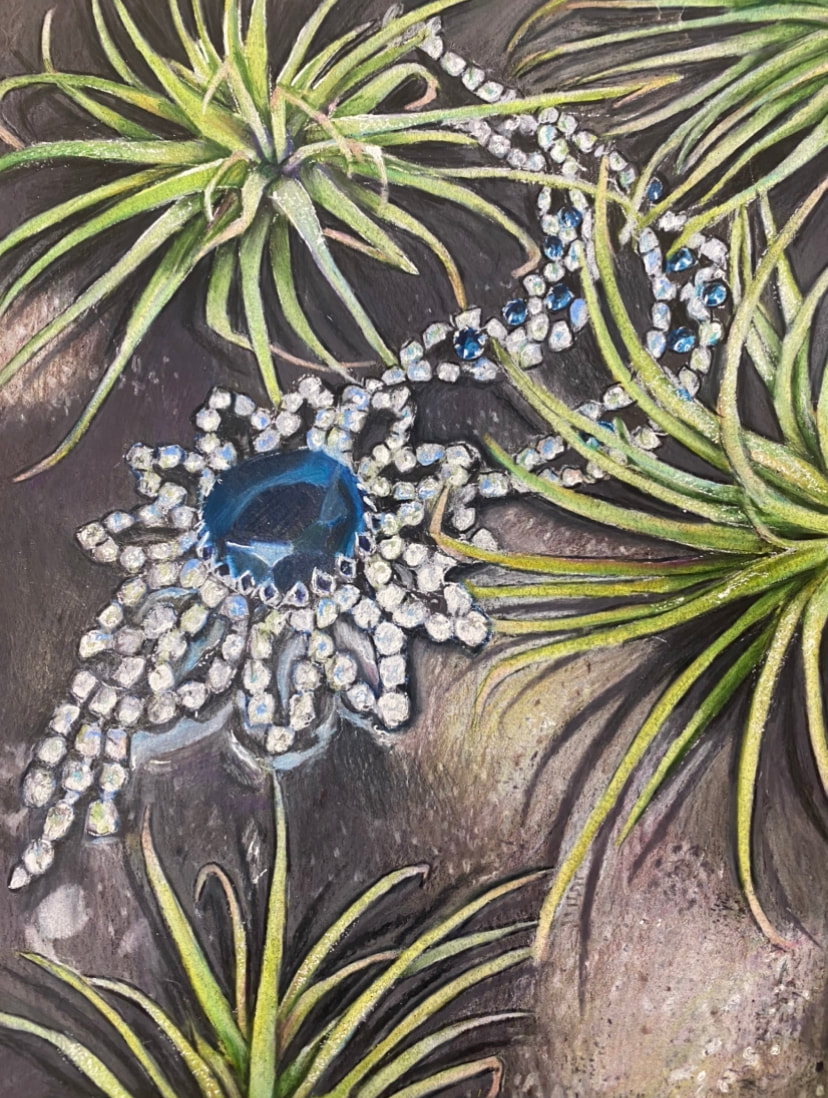 Reflection of Piece"A Piece of Her"For this project we had to create something that reflected us as a person, as well as including reflective qualities. I came up with a list of 20 ideas for the project and narrowed it down to two ideas. One of my ideas was the reflection of the North Carolina state line sign into a puddle and in the reflection is the Georgia state line sign. This idea was inspired by me moving from Georgia to North Carolina. My second idea was including plants and my Great Grandma's necklace one a puddle of water. I love plants and I really wanted to show this in my drawing. My Great Grandma was a huge part of shaping who I am today as well so I thought it would be nice to add a part of her in the drawing. I ended up picking my second idea because it was more sentimental. I did a colored sketch of the piece so that I could layout where all of the colors were going to be. I then started on the final piece. I started by sketching out an outline of the image. I then began with a light layer of colored pencil that blocked in the major colors. I then kept adding layers to add shadowing and highlights. I saw that many colors reflected in the diamonds of the necklace and I made sure to add those in the piece. It was difficult to add the shadows into the piece especially because I added another plant into the piece that was not in the reference image. I also had a hard time getting the texture that I wanted in the piece because I had gone to hard with the colored pencil and that made it difficult to add on layers. To add more of the texture and the highlights I ended up using a little white gel pen. I overall enjoyed creating this piece and am really happy with the way that it turned out. I think that it really reflects me and who I am. In the future when using colored pencil I need to slow down and go light with my layering so that I will be able to add more details later.
Color Chart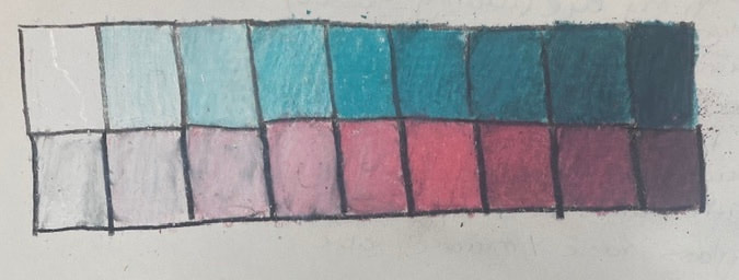 In class we created a color chart with colored pencil to practice creating different shades and tints of colors. Forms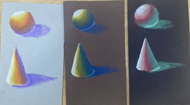 In class we created 6 forms on three different colored papers using a different color combo for each. This helped me learn to blend the colors together and create a smooth transition. Fruit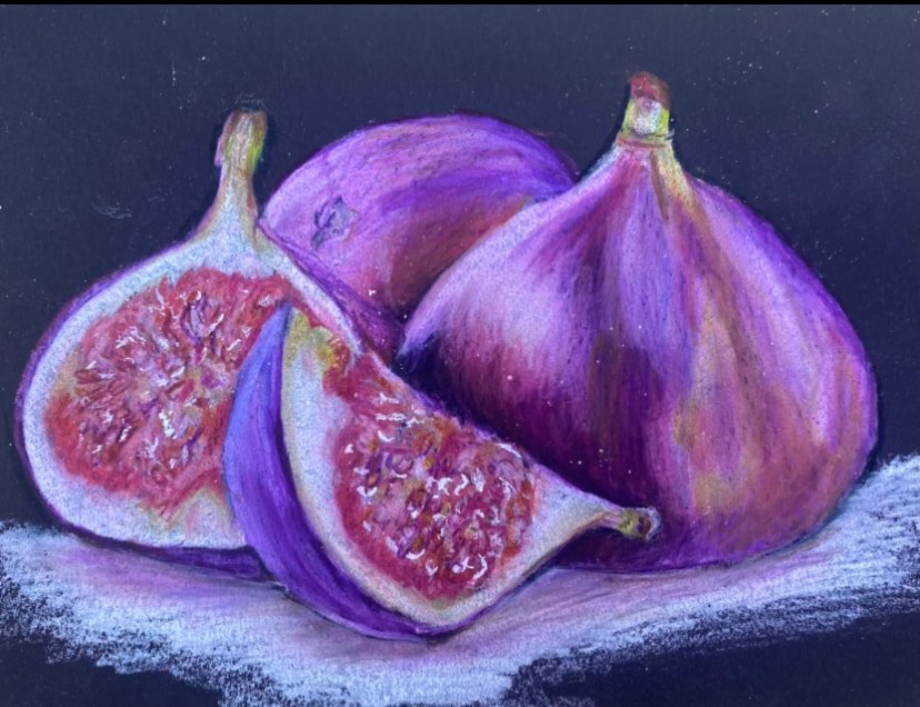 In class we chose a reference image of a fruit or vegi to practice drawing with colored pencil . This helped me understand how to create shading and highlights, as well as blending colors.
|