Brainstorm Ideas
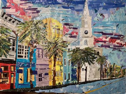
Compositional sketchesI chose both downtown London and Rainbow Row in Charleston, South Carolina as my two options. I feel like the London pictures are very dark and uninteresting while the Rainbow Row images are bright and colorful and have interesting angles. The London Images were my own and only two of the Rainbow Row images where mine so I did a compositional sketch of the image I chose of Rainbow Row. In progress photosThese are my in progress images and they show how my project went from just a sketch to being a colorful interesting piece. After I sketched the piece I then began to add paper in different textures and colors depending on the object I was working on. It took me about 2 weeks to complete this piece.. Final Collage
0 Comments
Brainstorm Ideas
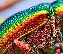
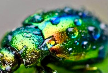
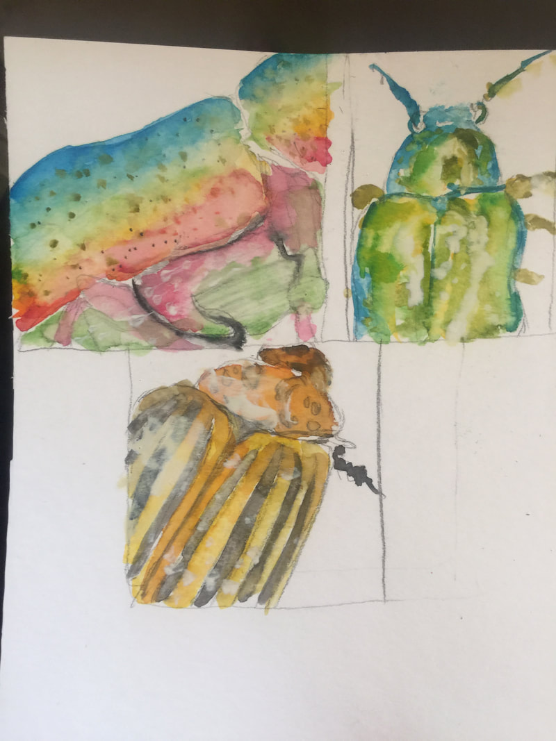
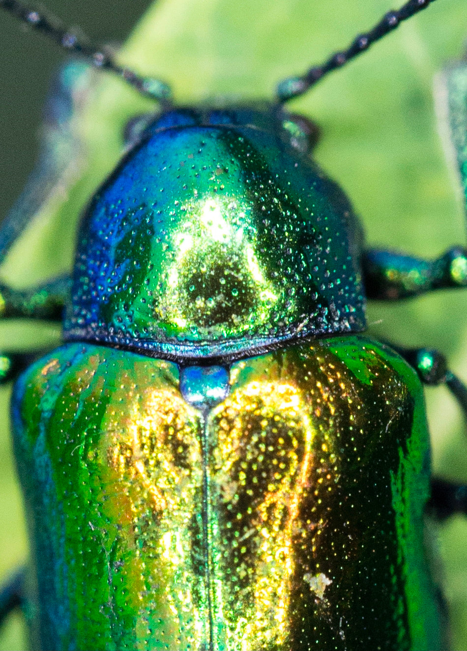
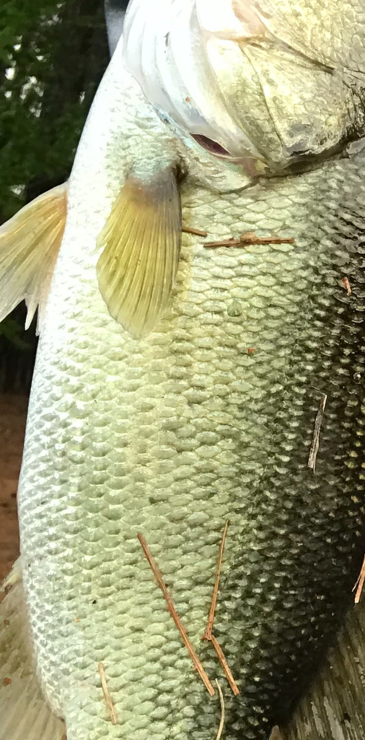
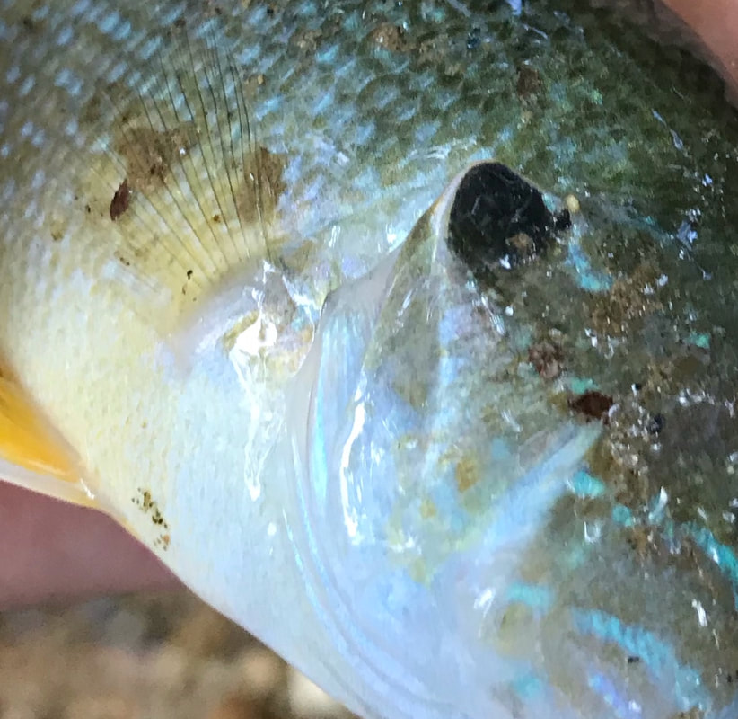
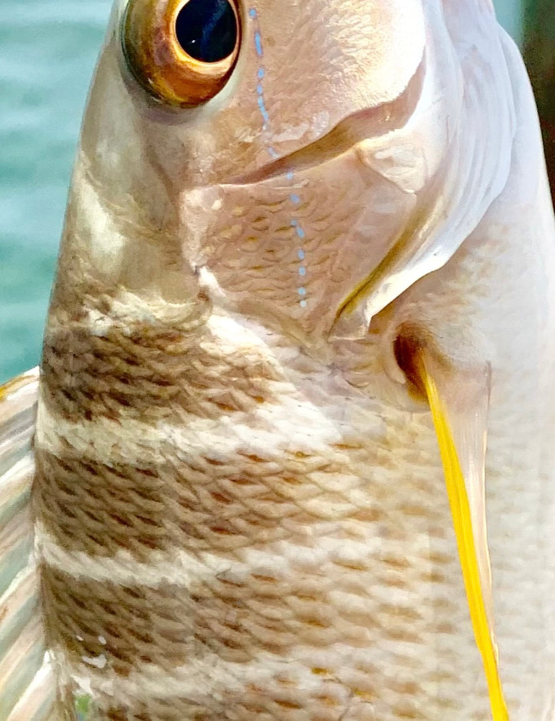
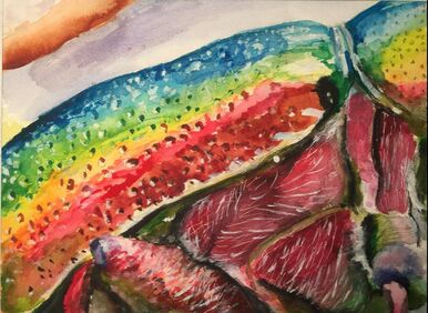
Compositional sketches for 2 ideas along with referencesMy two ideas that I decided between were a fish and a beetle. The fish references were my own and they were a little to simple for this painting theme. The beetle references I found online and I did a compositional sketch of three of them as well as cropping the images.. In Progress Photos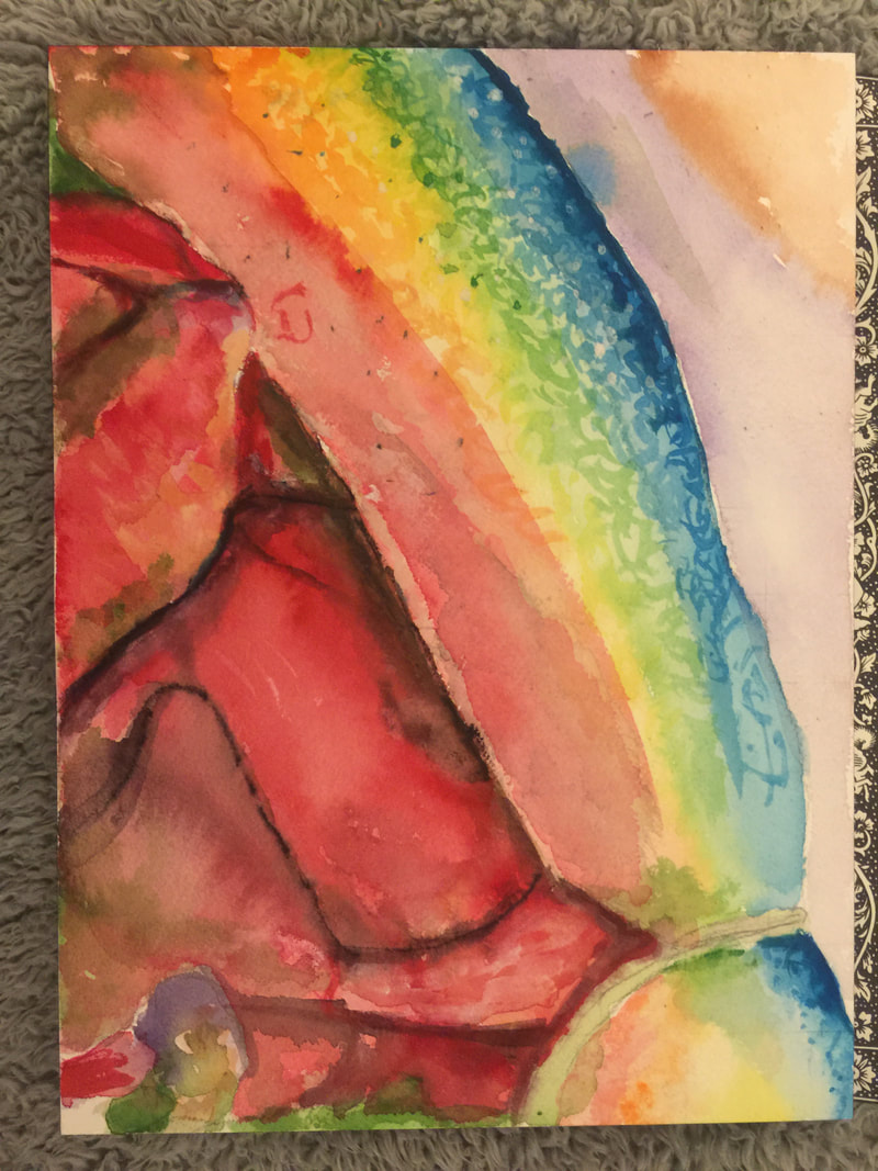 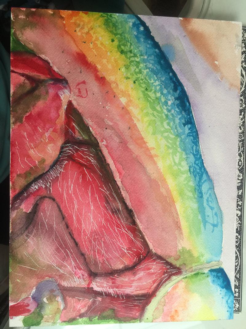 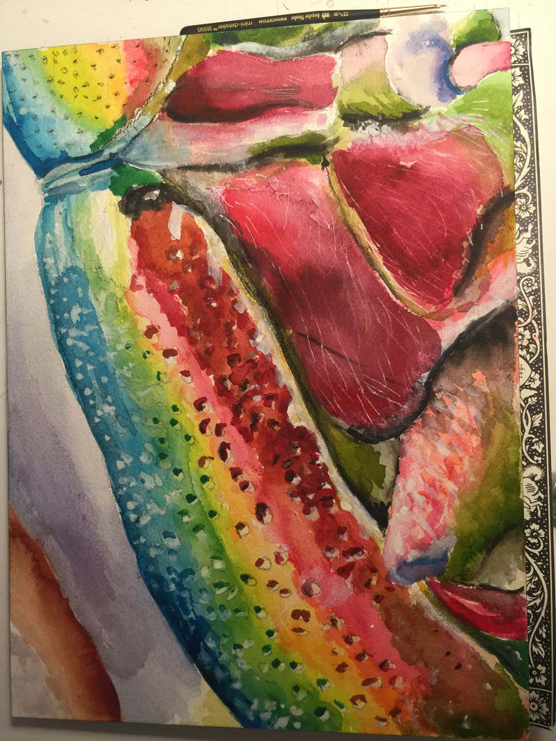 I first sketched out my piece with pencil and when I was happy with the outline I then went in with a thin coat of paint and was carful not to touch my white spots. After I had my base on I darkened up areas that needed more color. I then went in with my green and washed it over the red part of the legs. Lastly, I added the white hair with a white pen and white watercolor. Final painting
1. What watercolor/colored pencil techniques proved to be effective in your painting/drawing? How and
Why? The gradient color and the wet on dry techniques were effective in my painting. For the blending of the colors I used the gradient color technique to make that happen because it combines the colors and makes them flow into one another rather than having a line. The wet on dry technique helped me to get sharper edges such as on the leg. I used this for the shadows by putting down a light layer of black and then when it was dry putting a darker line of black were the shadow is at its darkest. 2. How important was using transparent layers (just layers for colored pencil) in your painting/drawing? Using transparent layers in my painting helped to show reflections of light on the beetle. This is important to make the piece look more realistic and give it its shape. 3. Explain how your composition was successful? Did you utilize all the elements of art and principles of design? Explain. My composition is successful because I feel that I looks almost identical to my reference and has a interesting view of the beetle which gives interest to the piece. I feel that I did use all if not some of the elements of art and principles of design. I used value to shape my piece, color to enhance my piece, the point of view of my piece draws interest, etc. 4. Was color choice an important factor in the overall success of the painting/drawing? Why? Yes, color was an important factor in the success of my painting because it is part of what makes the piece appealing to the eye and the bright colors make the piece happy and warm. I chose the beetle because of its colors because again, it drew my interest. 5. How did you use your knowledge of Georgia O’Keeffe as inspiration for this piece? I used my knowledge of Georgia O'Keeffe as inspiration in this piece because she always used natural items and zoomed into them to make them appear more interesting and detailed. This shows in my piece through the natural object I used and I also zoomed into the piece as well, to show texture and make it interesting. 6. Describe your craftsmanship. I started my piece by sketching out an outline and including outlines of shadows and highlights. I then, added a light wash of colors to my piece and used the gradient color technique to blend colors on the beetles shell and legs. I then made the colors darker and added my shadows. I continued to make the colors darker making sure to not touch my highlights. I used the wet on dry technique to enhance my shadows and add more green on the red part of the legs. I then added black to the holes in the shell and used darker versions of the colors in his shell as well. I lastly used a white pen to do the hair on his legs and made darker strands with white watercolor paint. 7. If you were an art critic how would you judge your work? I would judge my work by saying that I was spot on and the piece looks almost like the reference. However, I would also say that I needed more white hairs and more details on the legs. Overall it is a great piece but, there is still room for improvement. 8. If you were able to do something different what would it be and why? If I could do something different I would do a dog because that is what I am used to doing and I feel confident doing them. I know that I need to get out of my comfort zone but, if I could I would do a close up of a dog. I also love dogs eyes and texture of their fur and I think that It would be really fun to do a close up of a dogs face. 9. Explain to me what you have learned about watercolor/colored pencil and how it has improved or discouraged your development in art. I have learned what the different techniques are called and I have learned how to blend colored pencil. I never knew how to blend using colored pencil and I never thought I would like using them but, they are super fun and it is really easy to blend them. I love colored pencil and hope that I can use it later on. Watercolor is one of my favorite mediums and what I am most comfortable using. I learned what the different techniques in watercolor painting are called and how to achieve them properly. I feel like I have definitely improved my development in art by expanding my knowledge of watercolor and gaining interest in a new medium. 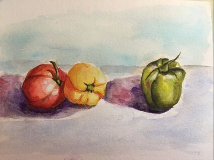 I had the chose to do copy a painting of peppers or pears and I chose the peppers. They took a long time and a lot of patience to create. I had to wait for one layer to dry and then another. I started with a sketch and then did my first layer of paint that was very thin. I then kept adding more value to the peppers. I added a background to the image to make it look more finished. Overall it was really fun and easy to create this. I loved panting in watercolor and I love the looseness of it.
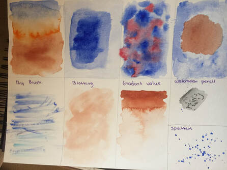 For this assignment I had to follow along with Mrs. Rossi and complete 9 different techniques that can be used in watercolor. The first one was gradient color, dry on dry, wet on wet, wet on dry, dry brush, blotting , gradient value, watercolor pencil, and splatter. They were all pretty straight forward and taught me about the variety of different looks that you can achieve with watercolor.
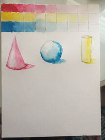 For this assignment I had to create three different value charts with primary colors. I also had to complete a sphere, cone, and cylinder in watercolor. This assignment helped me to improve on my transitions in color and making a 2D object look real or 3D. It was hard to get the different values in the shapes but, after doing it it became easy.
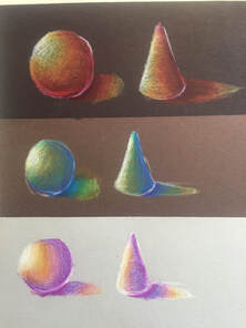 We had to use blending techniques on three different colored pieces of paper. I sketched out the same shapes on all three colors of paper and used different colors for each paper. This practice helped me to improve on my blending and making shapes look 3D.
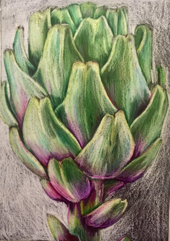 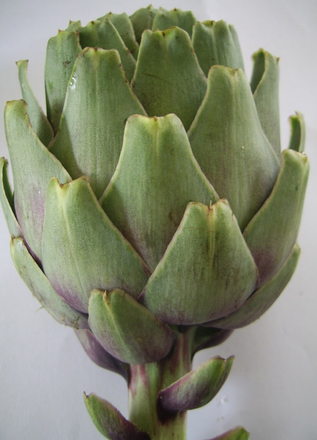 For this project we had to draw a fruit or a veggie that had value changes so that I could practice smoothly transitioning the different colors between each other. I drew a artichoke and started with a grid to get the right proportions and then after I outlined the shape I did a light layer of colored pencil and continued to get darker as I went;
Brainstorming Ideas
In Progress Photos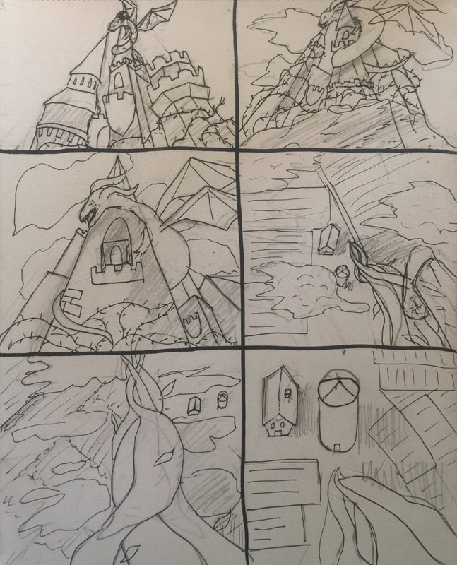 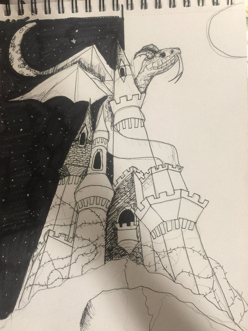 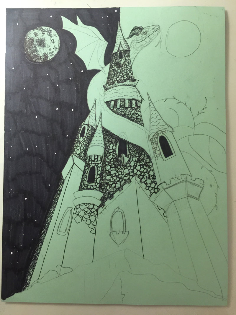 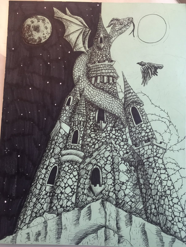 Final Drawing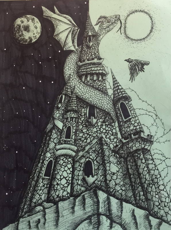 Discuss your decision on pen and ink techniques. Why you chose to use one or more. (If you used stippling in certain areas explain why you chose this technique. Explain for all other techniques used).
I used hatching for most of my drawing because I have a lot of stones. The stones needed to have a rough looking texture so I used hatching to help give them that look. I used stippling on the dragon because I thought the stippling looked like scales and it created contrast from the castle. How did you use perspective? Why is perspective important? I used three point perspective in worms eye view. Perspective is important because it gives emphasis to a certain object and gives the piece power. In my piece the idea of power was in place with the perspective that I chose. How is texture important in your composition? Texture is important in my composition because it makes all of the objects look more realistic.. Without the texture the peace would also be boring and it would look unfinished. Why is value so important in this project? Value is important again to make the objects look more realistic and make them pop off of the page. Without value there would not be enough contrast to separate different objects from each other. Describe your craftsmanship (How well the project is crafted technically) I think that I could have been a little neater with my hatching nut, I really think that I nailed the values in my piece. I did do the drawing first in pencil and I feel like I should have done more details in pencil before going in with the pen so that I could more easily fix mistakes. If you could recreate your piece what would you do differently to enhance your final outcome? If I could recreate my piece I would try to do as much as possible in pencil before adding the pen to limit mistakes. I also feel like I need to improve on the dragon by making it more realistic. (Only answer if you did fairytale) Which Fairytale or Fable did you create? How did you represent the story in your own way? My piece is based off of Sleeping Beauty. The drawing is of Sleeping Beauty's castle and Maleficent has turned herself into a dragon to make sure no one wakes her. The sky in the background represents all of the nights and days that sleeping beauty spent in her sleep.. The thorns around the castle are the thorns that Maleficent put up again to make sure no one woke the princess. Lastly the crow in the sky is Maleficent's assistant flying to warn her about the prince coming to wake Sleeping Beauty. When applying the pen and ink techniques why and how is it important to make sure you understand the concepts taught in class? It is important in order for you to efficiently use the techniques and use them in the correct spaces in your drawing. It will only help you improve on your art and make you more knowledgeable about pen techniques. As a growing artist how do you think what you have learned will guide and better your future projects. I think that what I have learned will help me broadened my artistic ability and give me more options for mediums to use in the future. This has also helped me to become more confident in my pen and ink drawing ability as well as my perspective ability. Perspective is something that people use in their everyday lives and it is used in many jobs so this new skill will be very beneficial. Pen Value Chart This chart showed how to change values using different pen techniques and helped us practice using the techniques. Pen Stippling Worksheet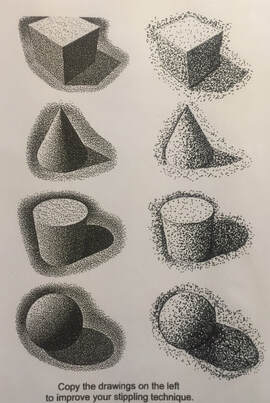 We had to copy the image on the left and use stippling. This helped me expand on what I can do with pen. 3 Texture Video Drawings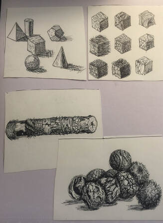 We had to watch 3 videos on pen and ink textures and copy them in our sketchbook. Practice Pen Object We had to draw a random object in pencil and then use any pen technique to give it value.
For this assignment we had to take 5 forced perspective photos.
 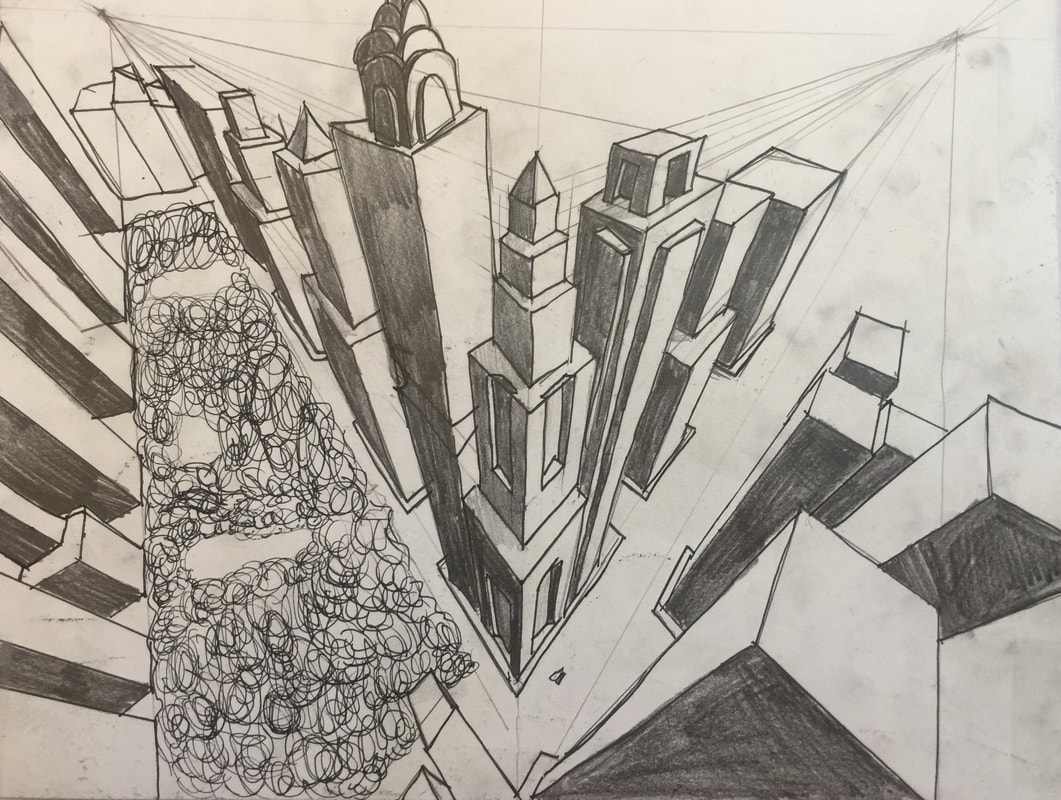 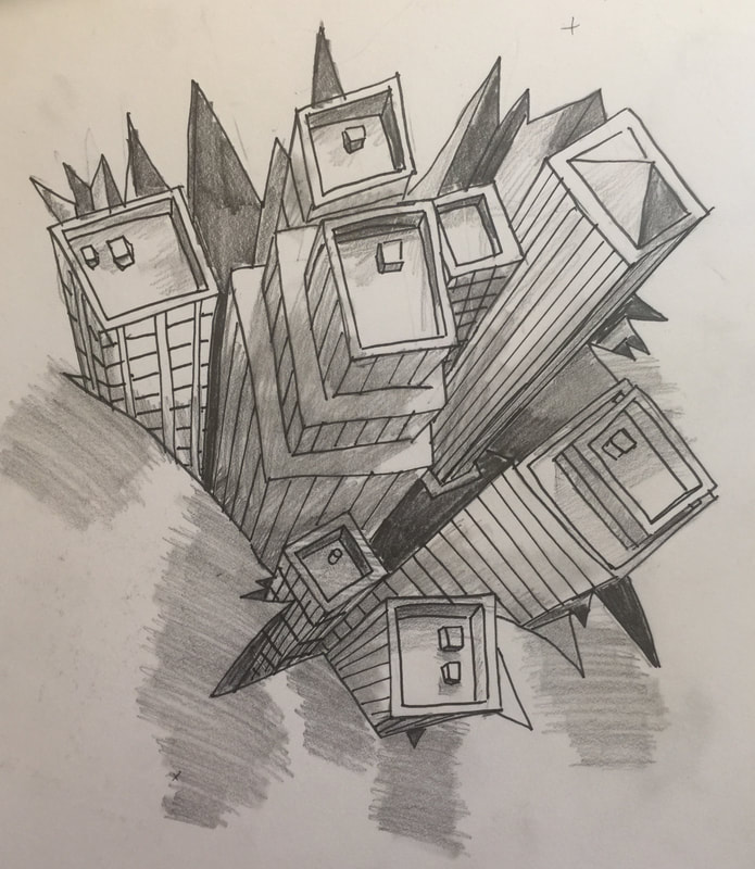 For this assignment we had to watch 2 step by step videos on 3 point perspective. The first one is from a worm's eye view and the second is from a birds eye view.
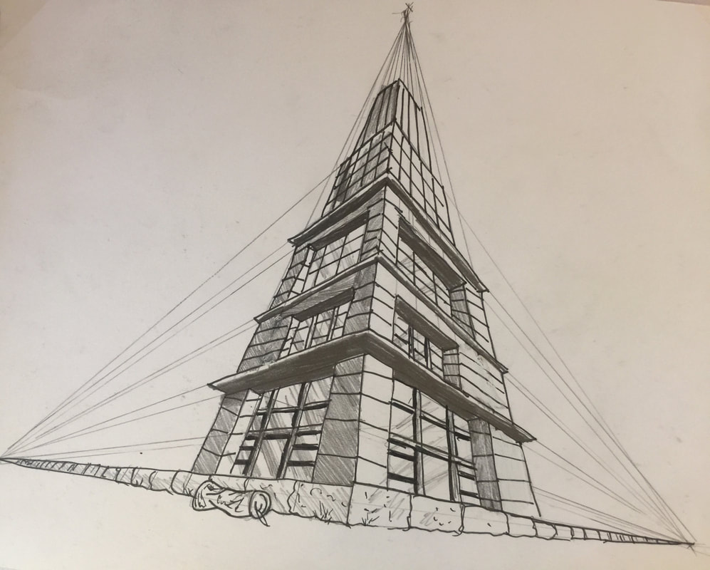
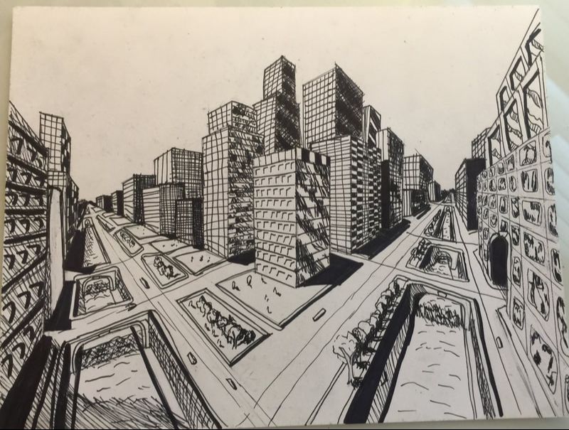 For this assignment we had to watch a video that went step by step on how to draw a 2 point perspective city scene.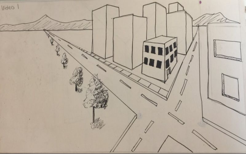 For this assignment we had to watch a step by step video on how to draw a basic 2 point perspective scene.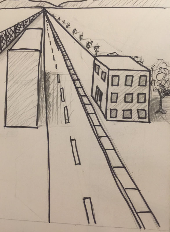 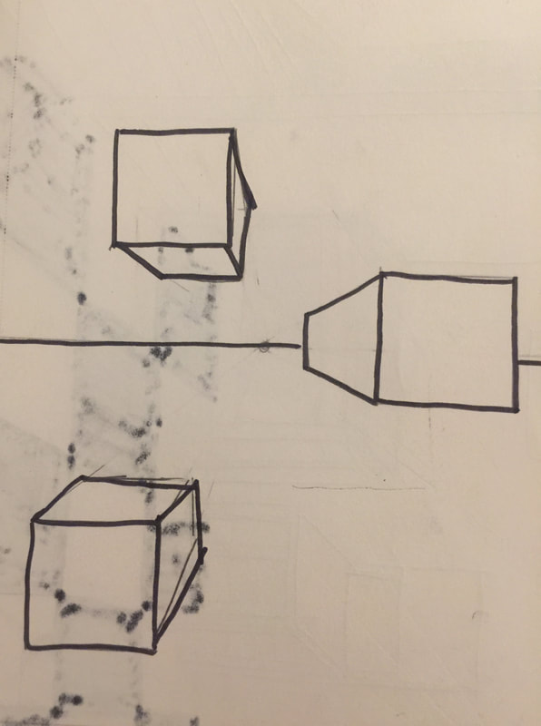 For this video we had to start by drawing three boxes(second image) and then use the one point perspective to show the different views of the boxes. The second part of the video had us draw a street scene using one perspective as well. 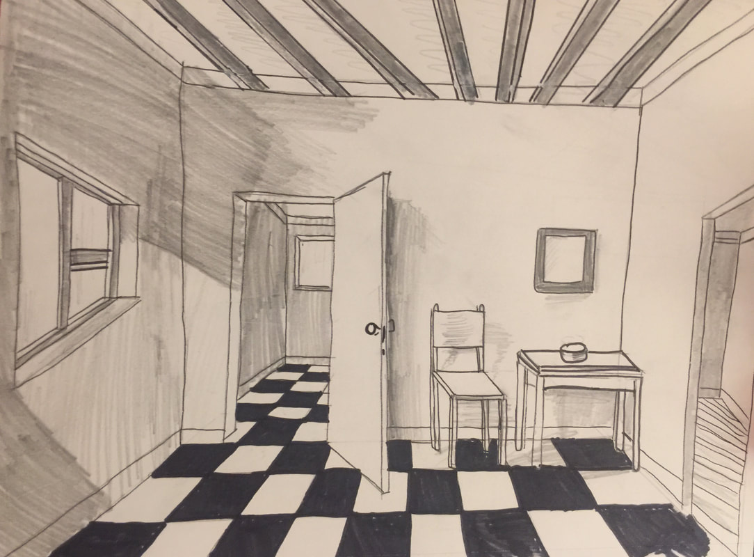 For this video we had to draw a one perspective view of a house/room. I started with a center point and drew an X from there which gave the base for the entire image.
 For this assignment we found an object in our house and sketched it with pencil. After the sketch was done we had to use a pen method in which I used random line and cross hatching to create value in the piece.
BRAINSTORMINGThese sketches were used to figure out which drawing I was going to chose. I did an avocado, tomato, lightbulb, and the inside of a trash can. 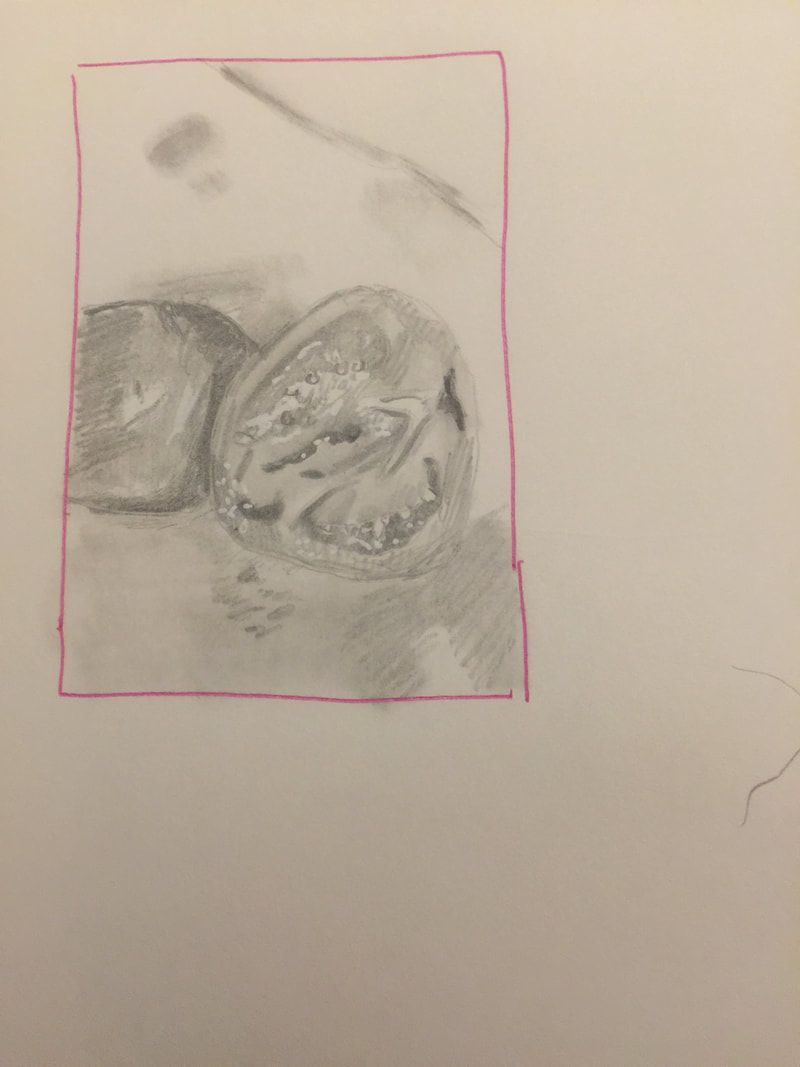 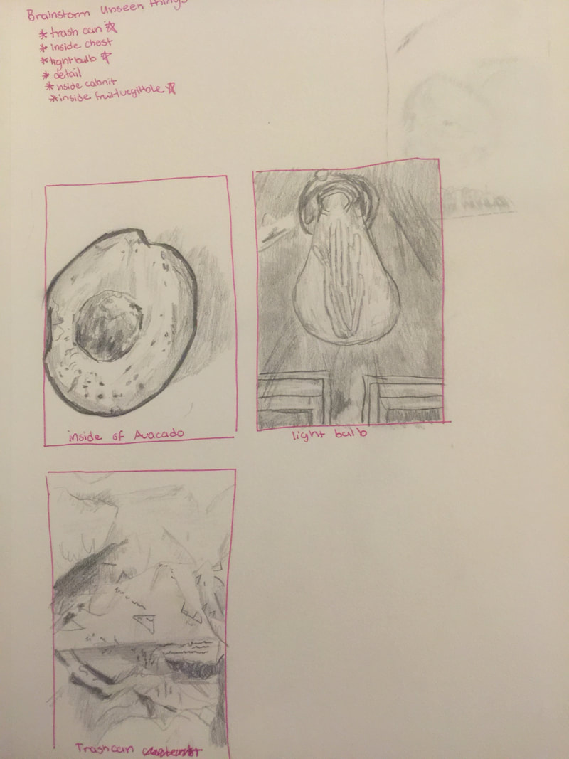 SKETCHESThese are my IN progress sketches that show my process. 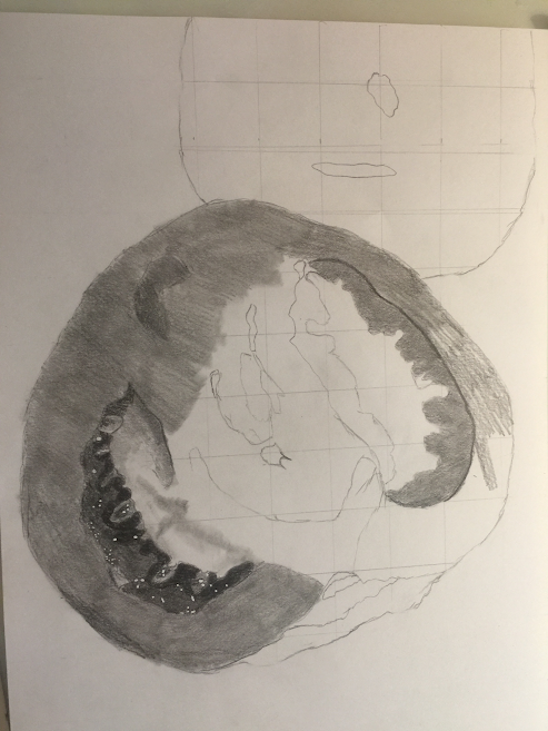 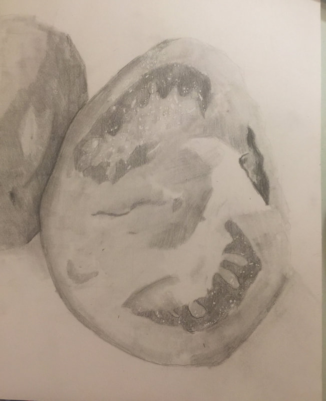 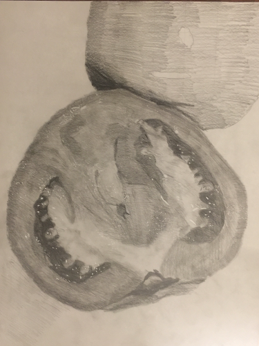 Final Drawing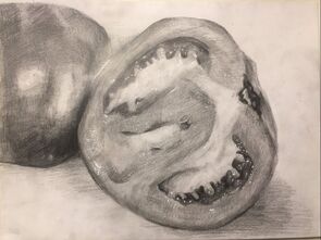 Describe how you arranged your composition. Discuss your use of the elements and principles. Is it a successful composition?
I arranged my composition to enhance the inside of the tomato and I also wanted the inside to be my focus. I think that it is a successful composition in showing the unseen things.. It really focused on the inside of the tomato which is what I was hoping to do. Did you use a wide range of values? (A range from white to black with at least 9 values). Explain how is this evident? I did use a range of values and this is evident through the seed section of the tomato which is much darker (almost black) than the rest of the peace. There is also range of values in the shadows that go from dark to white. Explain how your knowledge and creating practice studies with value contributed to your piece. The knowledge that I had in creating practice studies with value helped me to know how to create the darker portions and make it fade out smoothly. This helped me create the smooth outer part of the tomato by creating different values fading into one another. Describe the blending and transitions in your objects (discuss your use of pressure with pencil and other techniques to achieve this). The blending in my peace was achieved by starting with full pressure and then gradually lifting to a light pressure. I also created dark areas first and then faded them out by erasing or even going out gradually with my pencil. Explain how your interpretation of texture is essential in capturing the look of the object. My interpretation of texture is important for this object because the tomato is smooth and does not have lines or anything on the outside so I needed to create this smooth effect in order for it to look like a tomato. The inside of the tomato was more bumpy and if I had made it smooth like the outside, again it would not look like a tomato. If you could recreate your pieces what would you do differently to enhance the final outcome? If I could recreate my piece I would make the values darker and add even more highlights. This would help to make the image look more realistic. 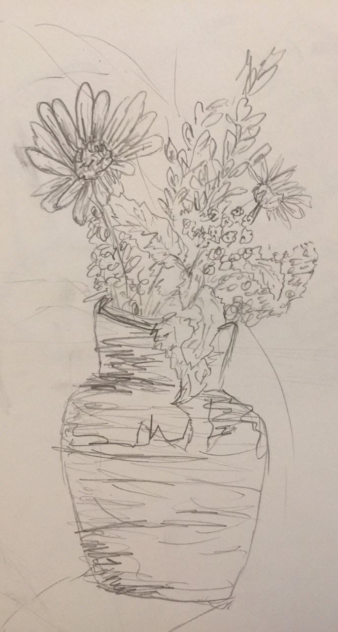 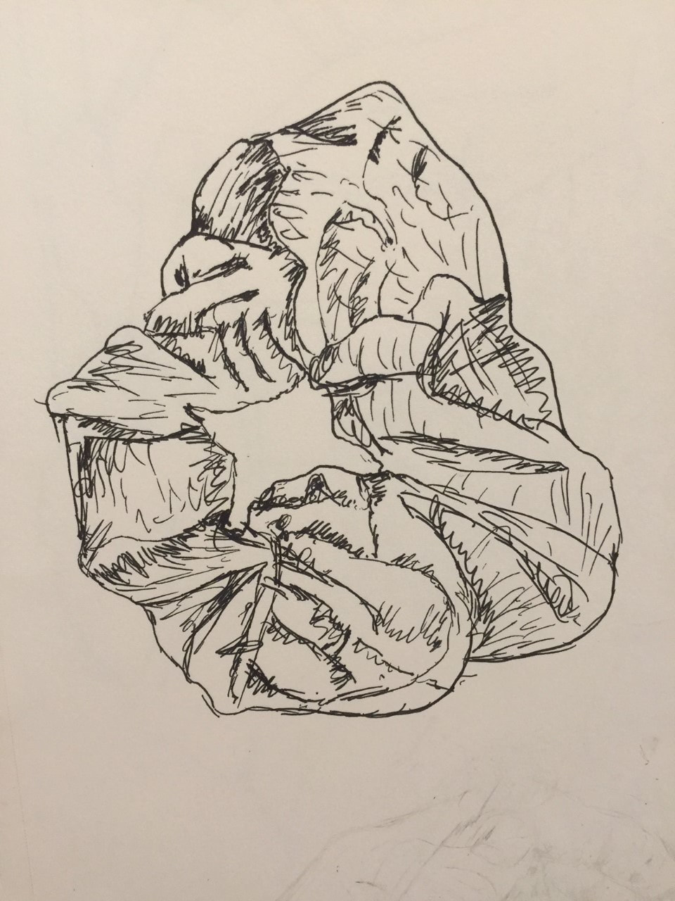  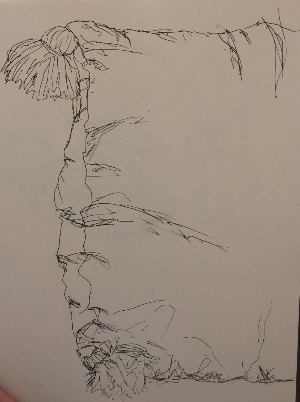 For this assignment we had to take four objects and contour draw them in both pen and pencil.   In this assignment we had to draw to contour drawings(one in pen and one in pencil)each is 20 mins. This helped me learn the value of time when doing an art piece.... the slower you go the better. 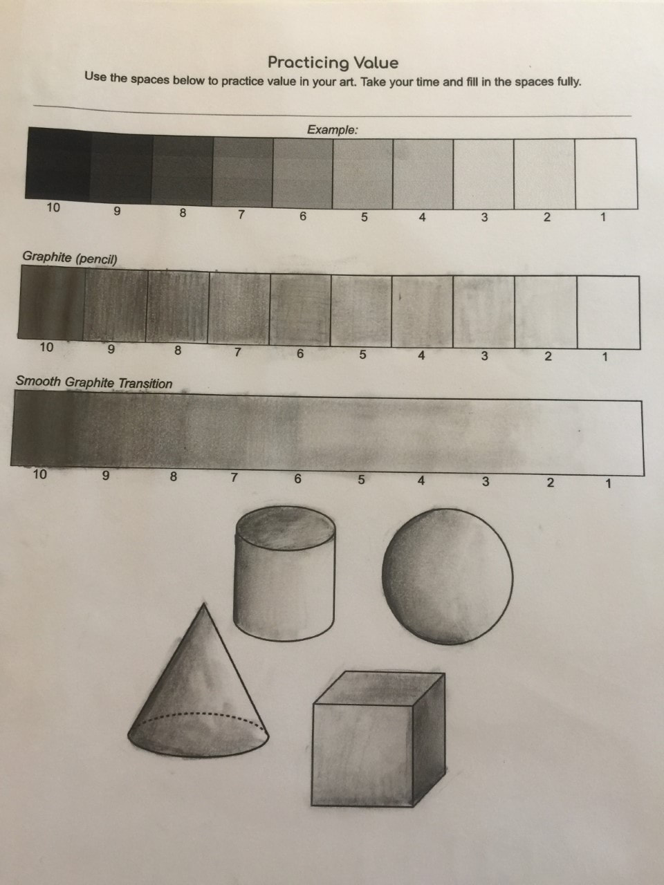 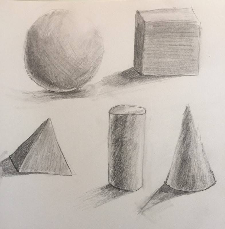 For this assignment we had to draw a cylinder, cone, pyramid, cube, and sphier. I feel like I did an ok job but I feel like I could smooth things out better.
Practice PhotosFinal Photos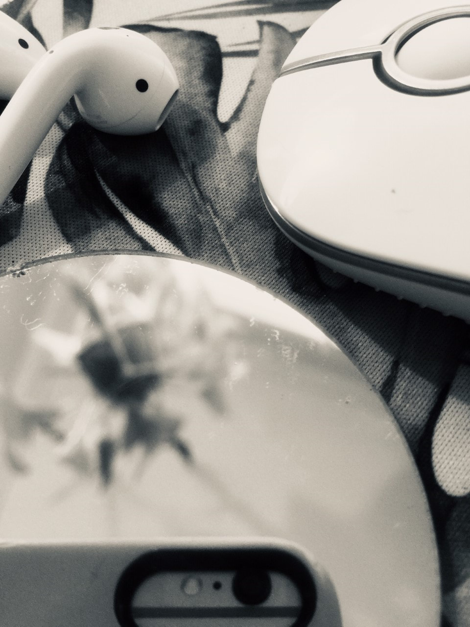 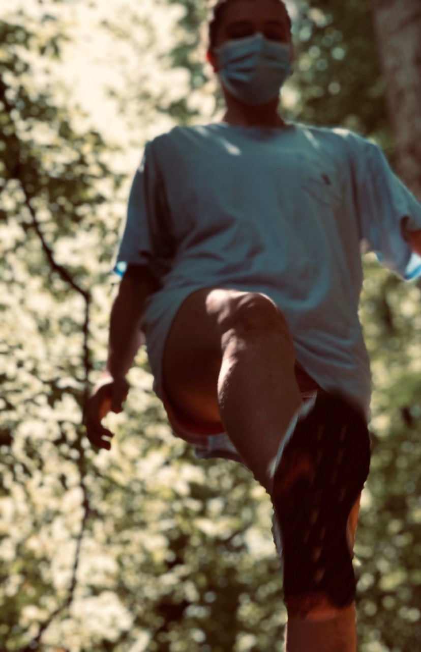 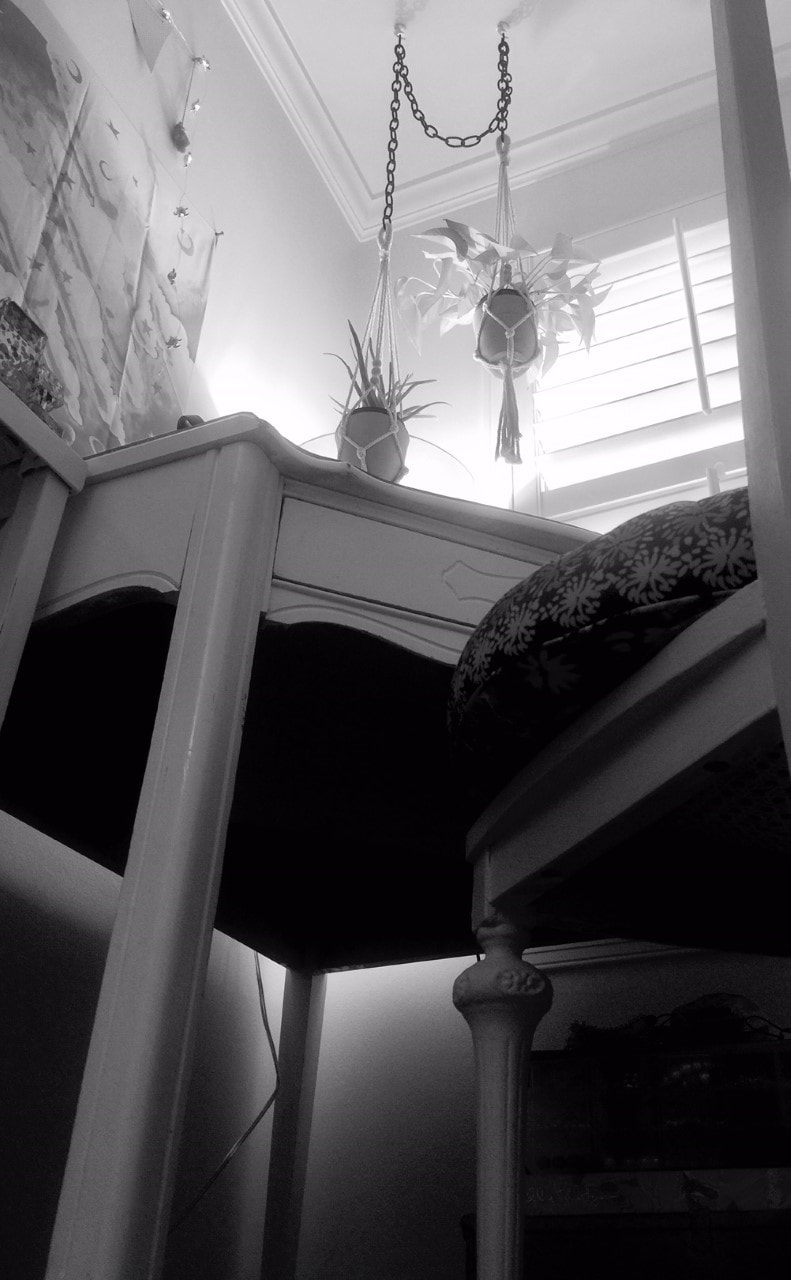
DESCRIBE: Describe your piece and what it is. How would you explain it to someone over the phone or who has never done this type of art before?
My piece represents the beginning of the online school year. For this project we had to make a story out of three images that represented this theme. I chose technology, mask wearing, and a single desk for my three story images. They all work to create on main idea. ANALYZE: Explain at least 1 of the following in your piece: space, color, shape, form, value, texture, or line. Explain at least 1 of the following in your piece: Balance, unity, variety, emphasis, movement, pattern, or proportion. My piece uses dark colors to make the point that this beginning of the school year is difficult through online. I used space in my images to give the viewer a break. The image in the far left shows unity through bringing different pieces of technology into one image. This image also showed variety through the different technology I used. There is lots of movement in my second image which gives the idea of walking and this shows that people have to wear a mask everywhere they walk. In all of my images I emphasis one object more than the others such as the desk in my last image. INTERPRET: Explain your idea behind your piece. What inspired you? How does your piece show this? (technique, subject, color, artist, other) I was inspired by the loneliness of our situation and the huge change in technology usage. My piece shows loneliness through the single desk and through my darker colors in my images. The desk seems to show power which is what I wanted in order to show the power loneliness has over you. I also showed the increased technology usage with my first image which showed a variety of different technological objects. The middle image was inspired by the annoying masks that we must now wear everywhere. I wanted to emphasize the idea of everywhere by taking the image in the forest which is not a normal place you see someone wearing a mask. JUDGE: What do you find successful about your piece? What did you learn from this assignment? I found that my images were successful in bringing out the idea of being in virtual school. They all showed creative aspects of online school and the quarantine. I also love the angle in which I took all of my images... I really think that each of them give off their own message. I learned how to take photos that interest your viewer and say something to the audience. This activity was really fun and it definitely made me think! For this project we had to draw shoes, a self portrait, a hand, and a one point street view. I used drawing pencils and an eraser for all of these pieces. The shoes are based of an image online, the portrait is a picture of me that I took, the hand is my hand, and the street is a city in Italy from the internet.
|